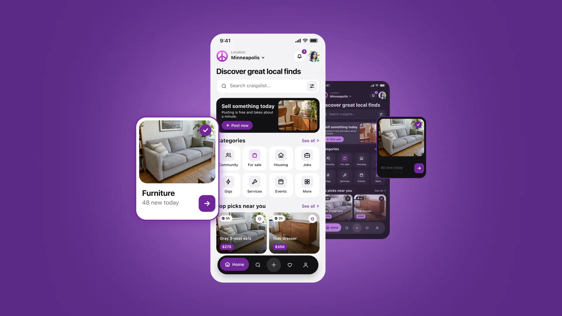
Independent case study
Craigslist Mobile Redesign
Modernizing Marketplace Discovery Without Losing Craigslist’s Identity
An independent native iOS redesign exploring how Craigslist can offer a clearer, more approachable experience for browsing, searching and contacting sellers while preserving its familiar categories and marketplace character.
Disclaimer — Independent conceptual redesign. This project was not commissioned, sponsored, approved, or implemented by Craigslist.
- Role
- Senior Product Designer / UX/UI Designer
- Platform
- Native iOS
- Industry
- Consumer Marketplace
- Year
- 2026
- Scope
- Research, UX, UI, Design System, Prototype
02
Project overview
The existing Craigslist iOS application offers extensive marketplace functionality, but its dense presentation and navigation patterns create opportunities for improvement.
Developed in response to a product design challenge, the redesign explores how Craigslist can feel more approachable without abandoning the simplicity and familiarity that existing users recognize. Instead of introducing an entirely new marketplace experience, it focuses on improving existing interactions. The example category is Furniture, in the Minneapolis, Minnesota Craigslist area.
Four required native iOS experiences
- Home
- Category browsing — one subcategory level and listing results
- Search
- Listing details
Design objectives
- Make category discovery easier.
- Improve search visibility and context.
- Make filtering and sorting more discoverable.
- Improve listing-information hierarchy.
- Preserve privacy and safety cues.
- Make navigation feel natural to iOS users.
- Retain Craigslist’s recognizable categories and navigation.
- Support both Light and Dark appearance.
- Provide a coherent, connected interactive experience.
These are design objectives, not measured business outcomes.
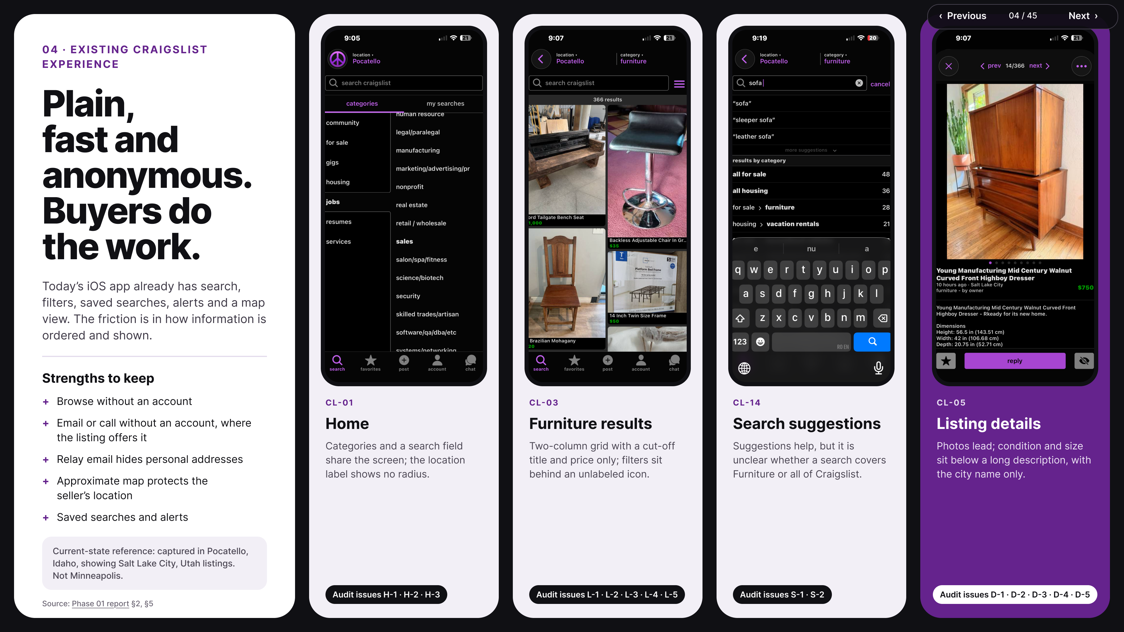
The current Craigslist app as documented on the Research page. Personal information visible in screenshots must be removed before publishing.
Figma source: Existing Craigslist iOS app — research screenshots (opens in a new tab)03
Research & market analysis
Research preceded UX design: secondary research, competitive analysis and a heuristic UX audit.
Direct competitor
OfferUp
Marketplace-specific patterns: listing discovery, categories, images, seller communication, safety cues and filtering.
Indirect UX benchmark
Airbnb
Structured search, category discovery, listing hierarchy, filtering, photography and contextual interactions.
Indirect UX benchmark
Lyft
Focused mobile navigation, location-aware interaction, bottom sheets, clarity and native-feeling task flows.
Competitor apps were inspected through reference screenshots and their existing experiences. Patterns were evaluated against Craigslist’s context rather than copied.
- Research sample
38
public-review records coded in the evidence log
Research sample
- Research sample
24
Craigslist reviews analyzed separately within that log
Research sample
- Audit finding
15
heuristic findings, 5 rated major
Audit finding
Counts describe the collected research sample only — they are not statistics representative of all Craigslist users. None of the 24 Craigslist reviews was exclusively buyer-authored, so some buyer-specific decisions are heuristic-led hypotheses rather than directly validated buyer needs.
Heuristic audit history
The original draft contained 12 findings. During revision, 10 were carried forward, 2 moved to “Not assessed,” and 5 were added — giving 15 documented findings. These are evaluator findings, not issues reported by primary users.
Evidence confidence
Only three evidence items reached Moderate confidence under the project’s final rules:
All other needs and opportunities are Low-confidence findings or design hypotheses.
Research limitations
- No primary user interviews.
- No completed usability-testing sessions.
- Limited buyer-only feedback.
- Older reviews potentially reflecting earlier app versions.
- Static-screenshot analysis rather than comprehensive device testing.
- A single evaluator for coding and heuristic severity assessment.
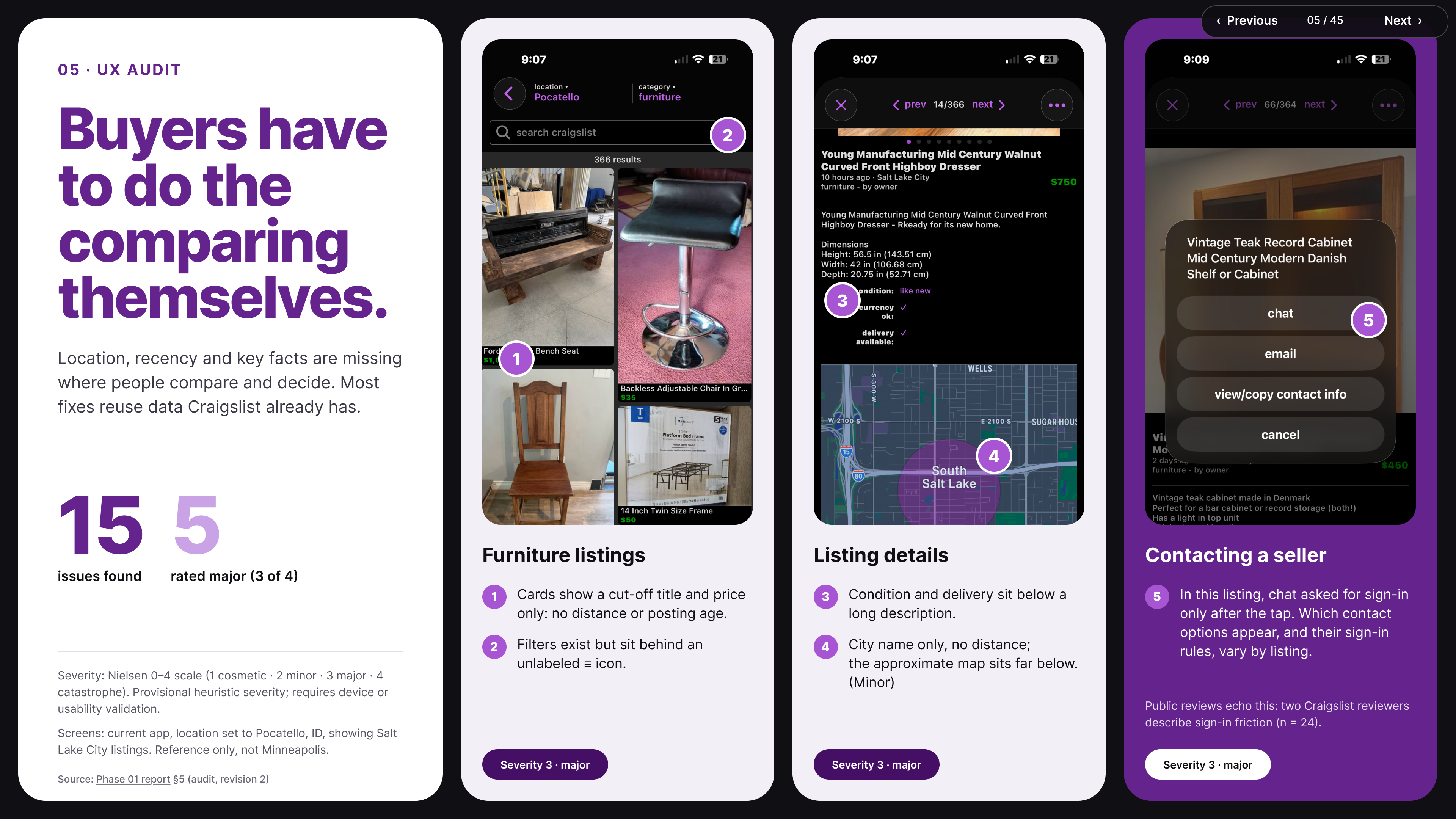
Selected heuristic audit findings from the revised audit.
Figma source: Craigslist UX audit slide (opens in a new tab)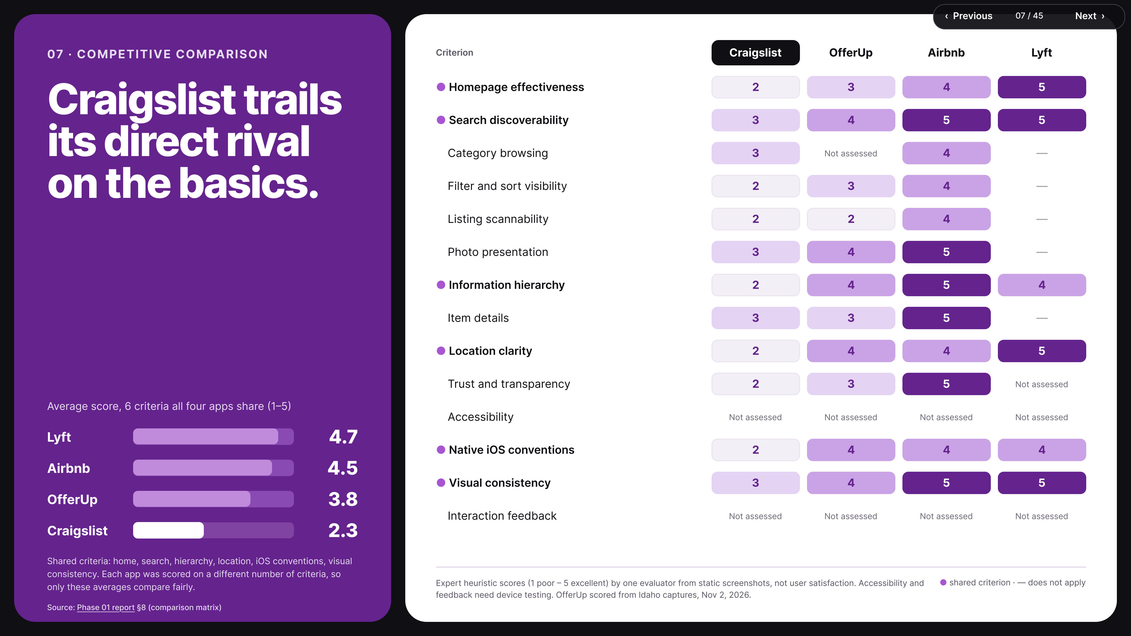
OfferUp, Airbnb and Lyft reference screens used for comparison.
Figma source: Competitive analysis evidence (opens in a new tab)04
Design challenges
Six problem areas framed the redesign — distinguished by the strength of evidence behind them.
Category discoverability
Heuristic-led opportunity
Search-context clarity
Heuristic-led opportunity
Filter visibility
Moderate-confidence evidence (E5)
Listing-information hierarchy
Heuristic-led opportunity
Communication clarity
Heuristic-led opportunity
Privacy and safety cues
Moderate-confidence evidence (E2, E3)
05
Information architecture
Preserve Craigslist’s authentic category structure rather than replacing it with a simplified, invented taxonomy.
Information architecture was completed before wireframing. The selected General Home — Option 0 — keeps Craigslist’s seven existing main categories and adds second-level category browsing. The original five-tab navigation remains, with the first tab opening the redesigned General Home. Navigation was deliberately not restructured beyond the assignment’s scope.
Central browsing path
General Home → For Sale → Furniture → Furniture listings → Listing details
Five-tab navigation (retained)
Contextual search scope
- From General Home, search initially covers All for Sale.
- From Furniture, search is scoped to Furniture.
The UX flows document Cancel, Back, query editing, filter retention and recovery. Some search-relevance enhancements remain design hypotheses requiring technical confirmation.
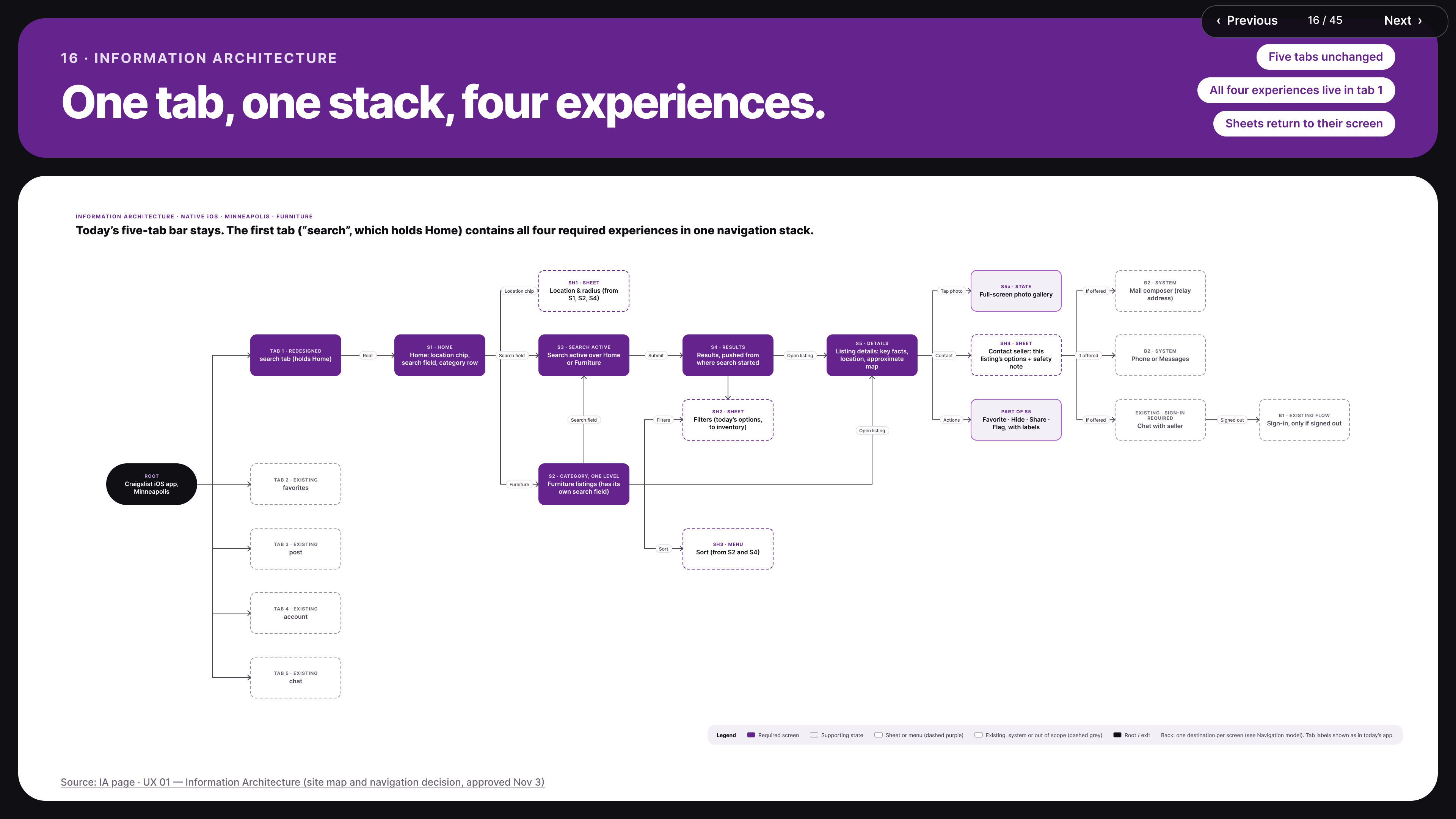
Category hierarchy preserving the seven main categories.
Figma source: Information architecture (opens in a new tab)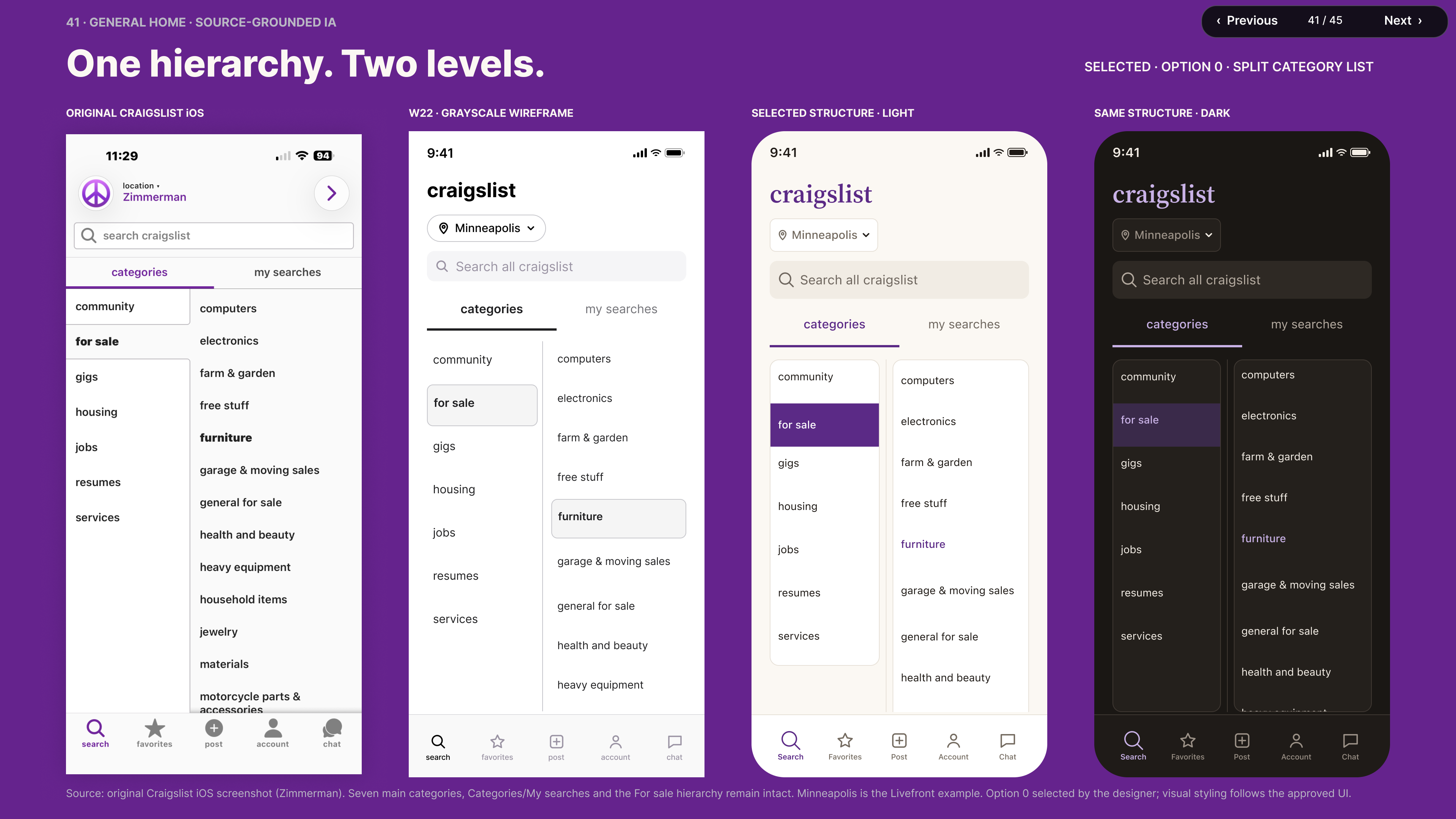
Approved General Home organization and browsing structure.
Figma source: Selected General Home, Option 0 (opens in a new tab)06
UX wireframe process
Pencil sketches → structured low-fidelity wireframes → high-fidelity black-and-white UX wireframes.
Stage A
Pencil sketches
Deliberately rough explorations of layout, hierarchy and navigation, comparing alternative arrangements before detailed UI.
Stage B
Refined low-fidelity
Structured grayscale wireframes for screen organization, navigation flows, search behavior, filters, sheets, contact options and recovery states.
Stage C
High-fidelity UX (monochrome)
Precise composition, realistic image areas and detailed interactions — still black and white, not the final branded UI.
The working set includes approximately 22 core and supporting states — among them General Home, Furniture listings, active search, results, applied filters, listing details, photo gallery, location and filter sheets, sort menu, contact options, loading, connection error, no results, and the Gallery / Grid / Thumb / List viewing patterns.
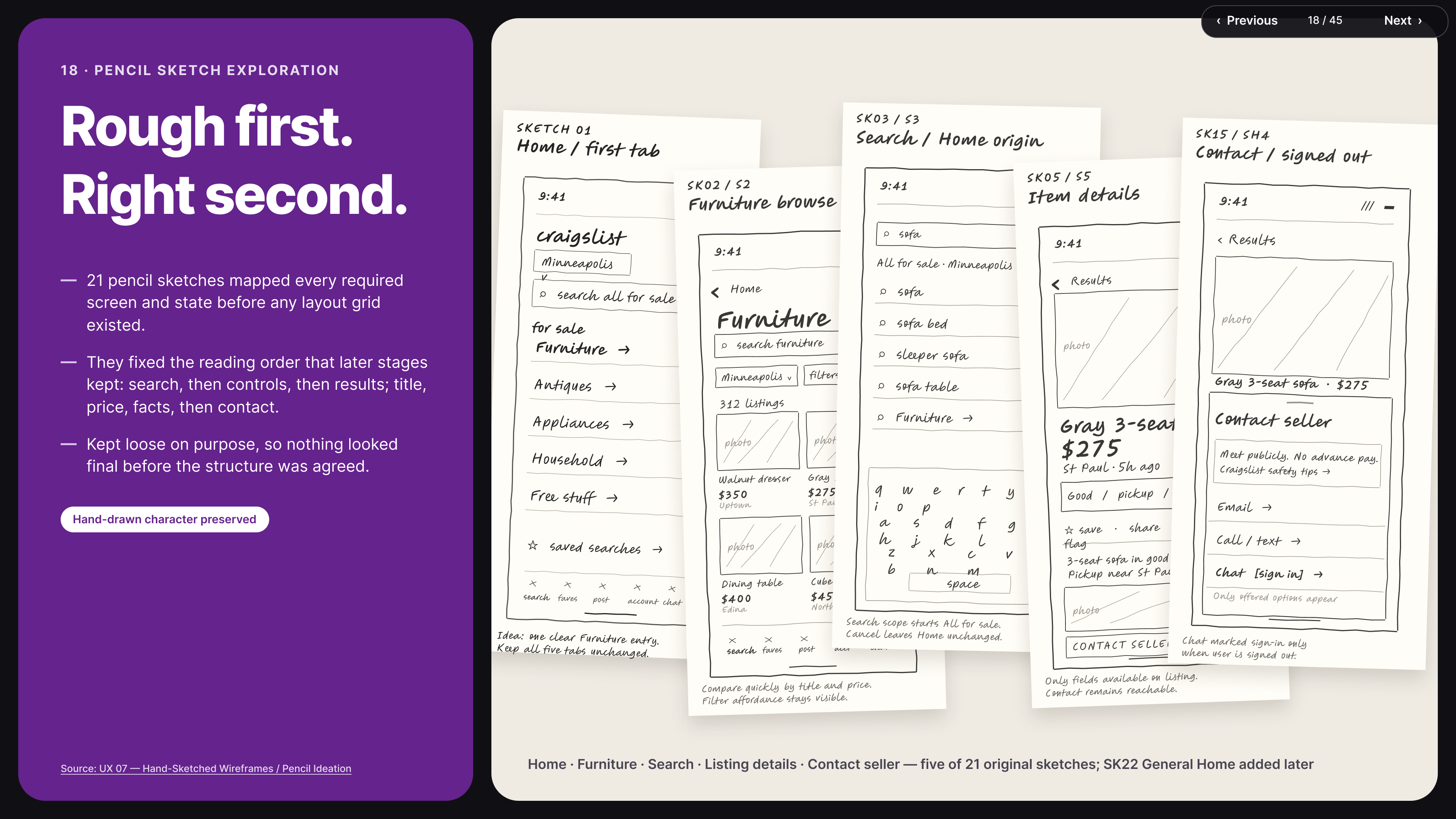
Early concept exploration.
Figma source: Stage A — Pencil sketches (opens in a new tab)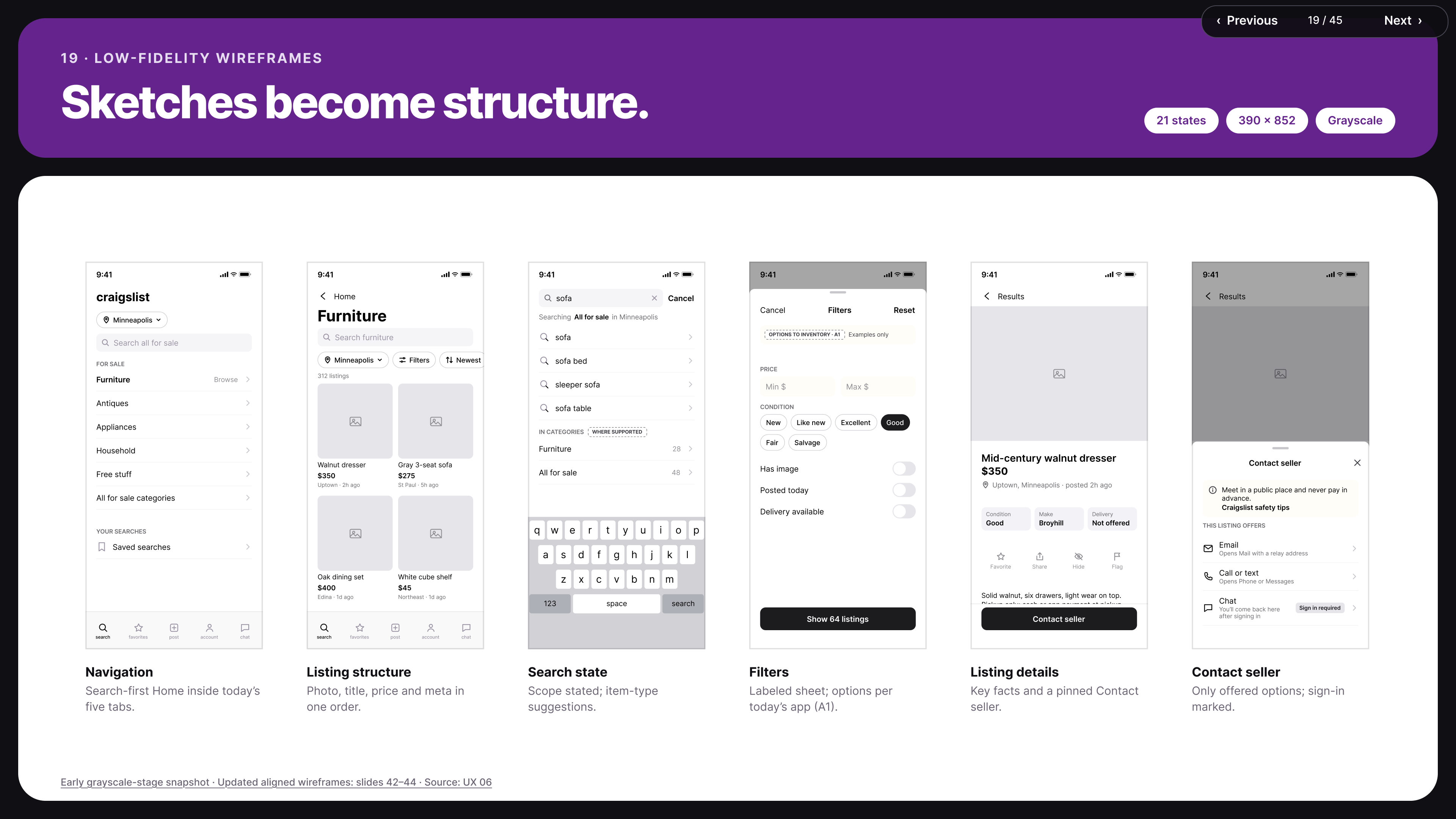
Grayscale screen and interaction structure.
Figma source: Stage B — Structured low-fidelity wireframes (opens in a new tab)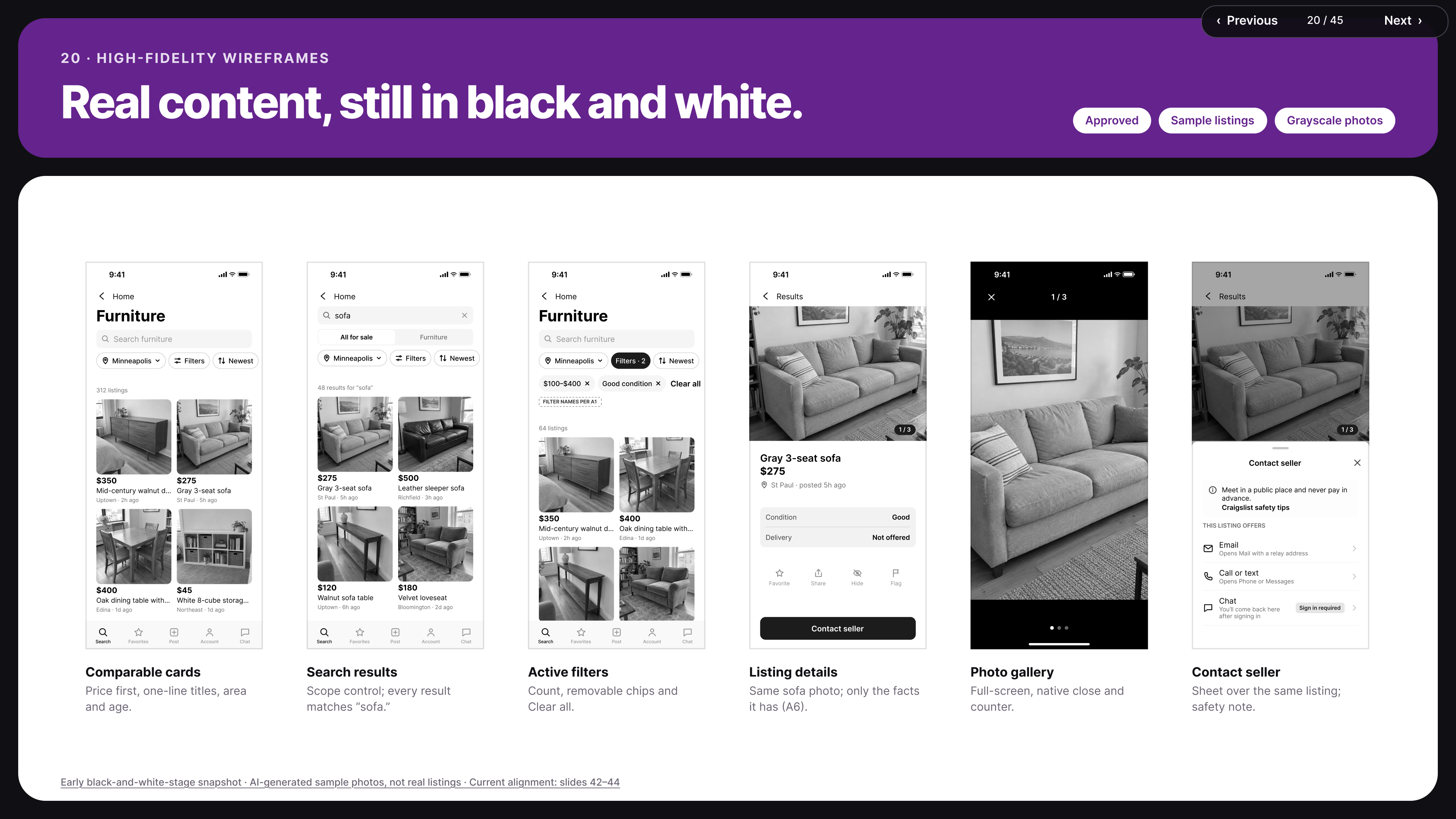
Monochrome UX wireframes before visual design.
Figma source: Stage C — High-fidelity black-and-white UX wireframes (opens in a new tab)07
User flows
Seven documented flows, centred on Home → Furniture → Results → Listing Details.
The flows cover category browsing, search, refinement, listing inspection, seller contact and supporting interactions, following established iOS navigation conventions. They define where a journey begins, what Cancel and Back do, whether filters and sort are retained, how search scope changes, how users return to previous positions, how contact methods vary by listing, and how error and empty states offer recovery.
Listing viewing modes (retained)
- Gallery — large images
- Grid — medium images, the default
- Thumb — smaller images
- List — no images
Results menu actions
- Change View
- Filter & Sort
- Show Map
- Save Search
- Share
View persistence, Save Search sign-in requirements and Show Map return behavior are documented assumptions, not verified existing app functionality.
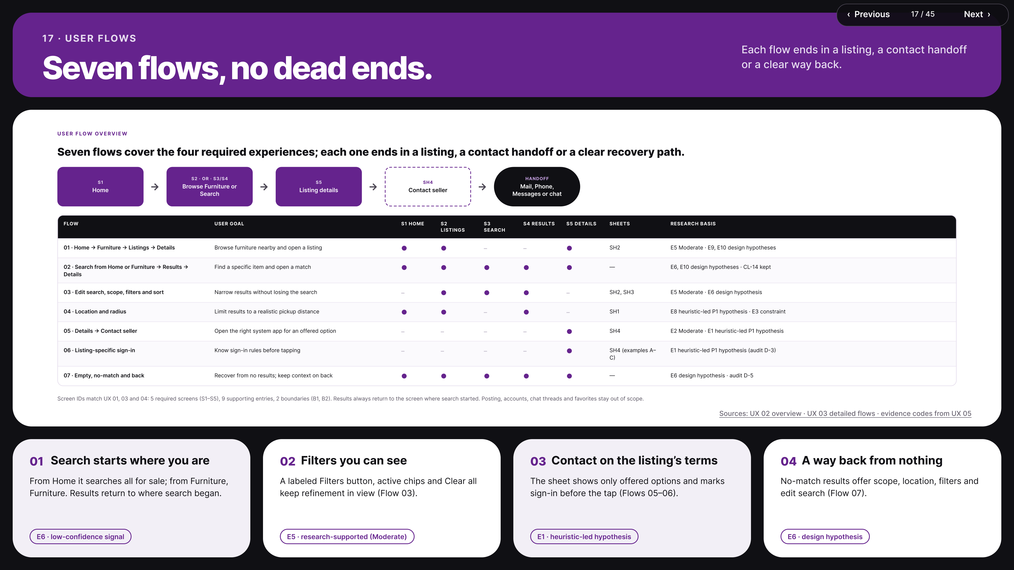
The seven-flow structure.
Figma source: Detailed user flows (opens in a new tab)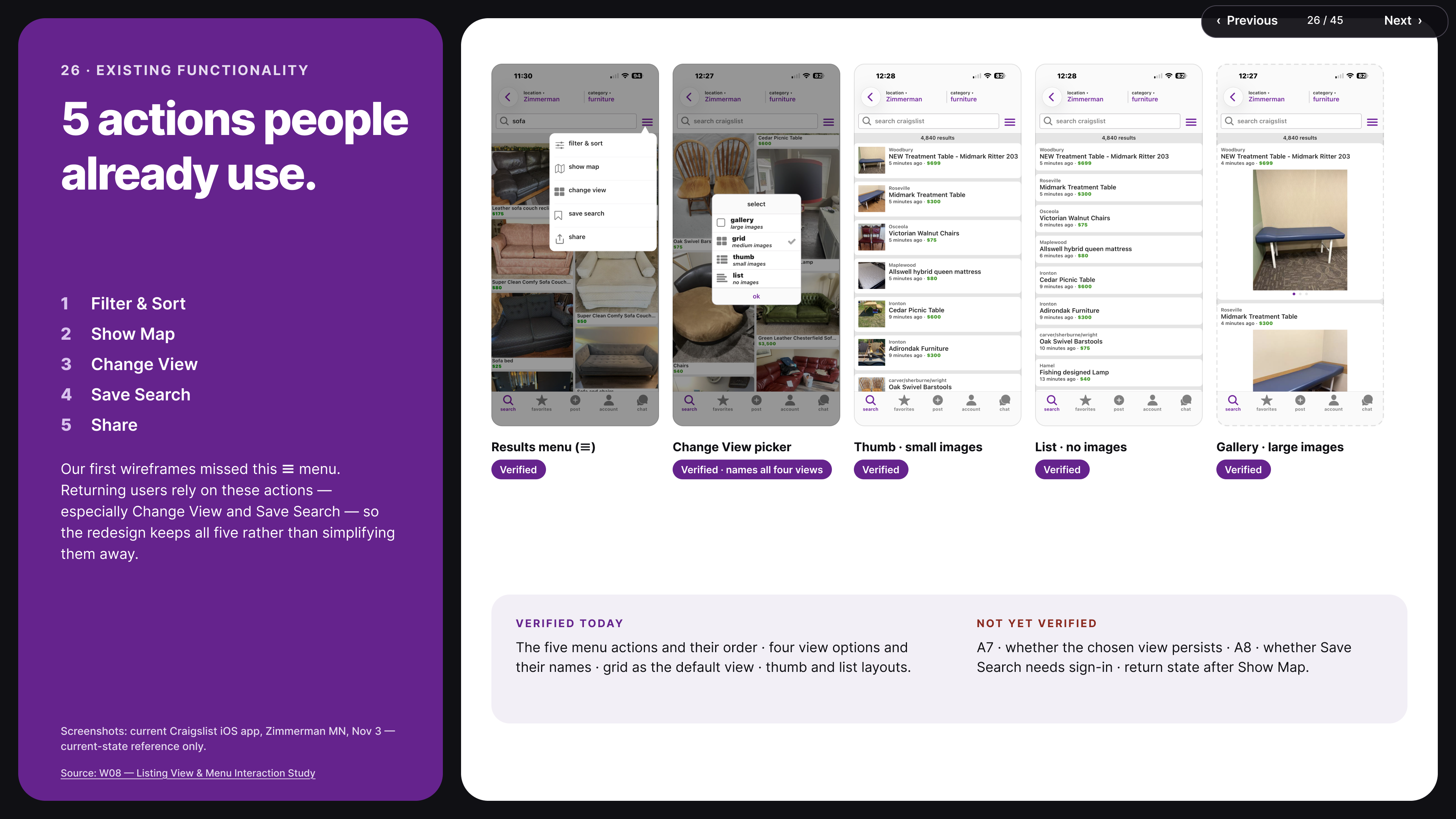
Documentation of the four viewing modes and Results menu.
Figma source: Results menu & listing views (opens in a new tab)08
Moodboards & visual direction
Three visual directions explored — Option 01, Refined Classic, selected for Light and Dark.
The moodboards combined real marketplace photography, typography, color palettes, interface references, composition, hierarchy, component styling and Light/Dark appearance. Option 01 — Refined Classic follows the user’s iOS appearance setting. It is a separate decision from the General Home structure (Option 0); the alternate Option 02 was held back.
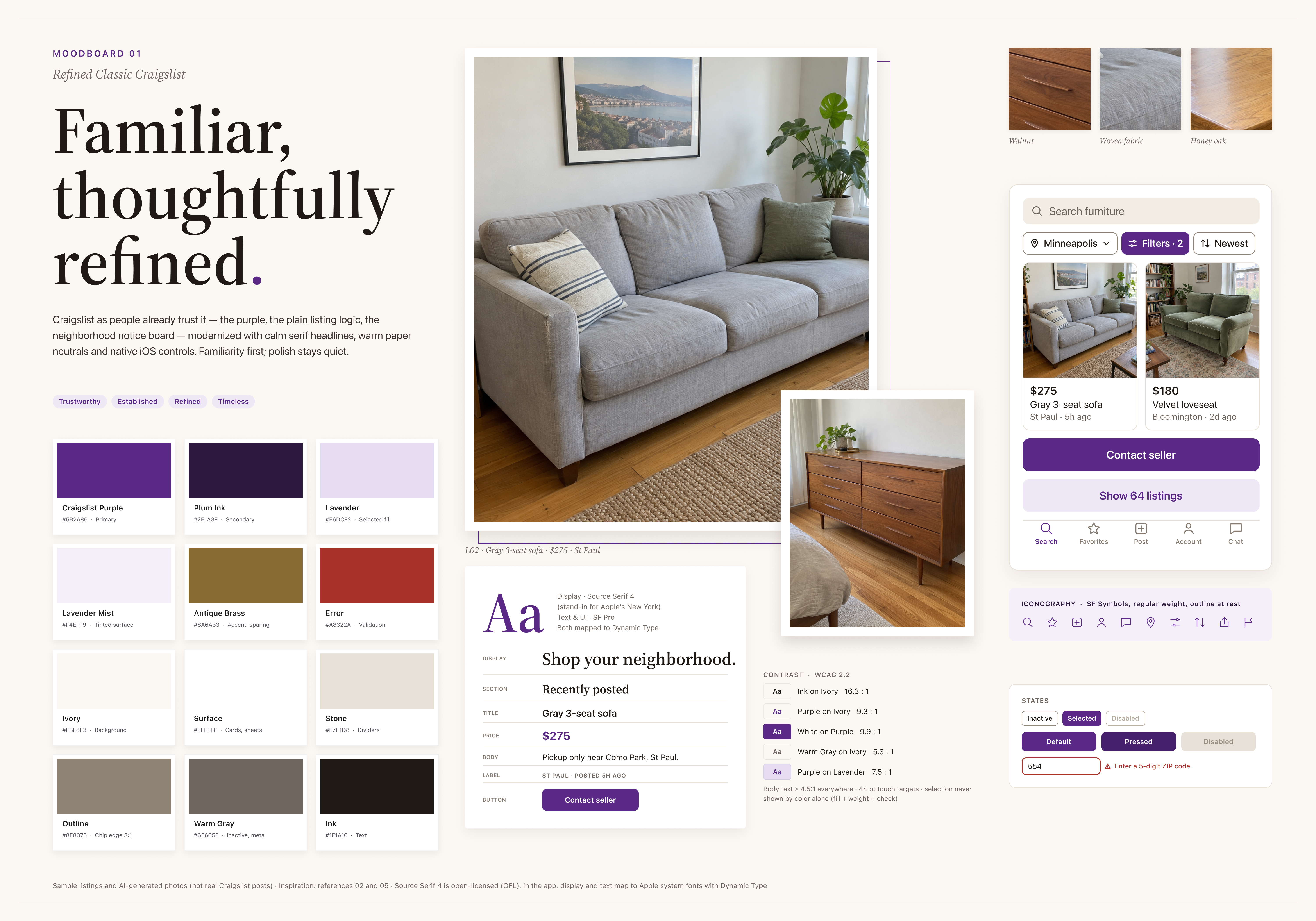
Visual exploration.
Figma source: Moodboard direction 1 (opens in a new tab)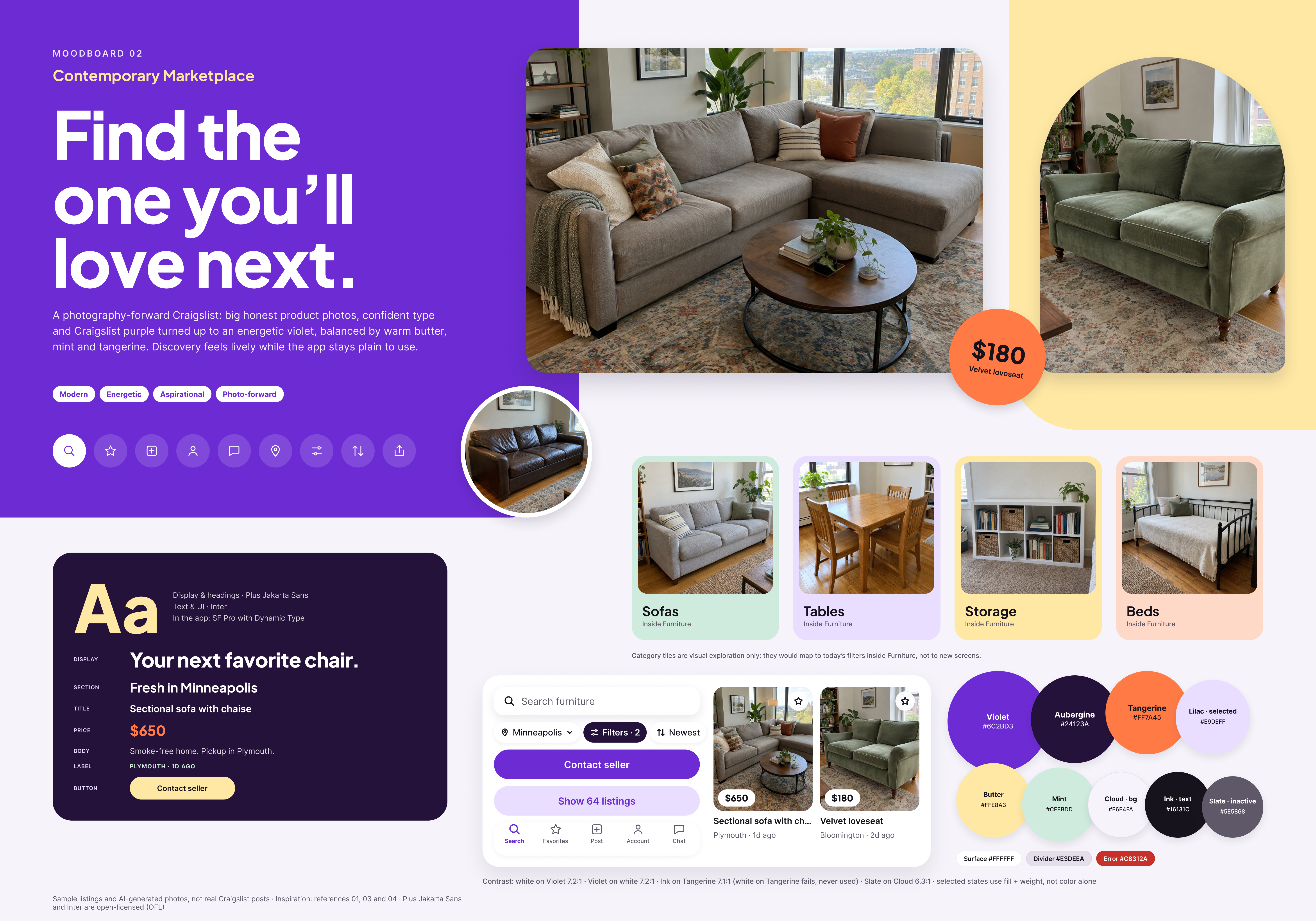
Visual exploration.
Figma source: Moodboard direction 2 (opens in a new tab)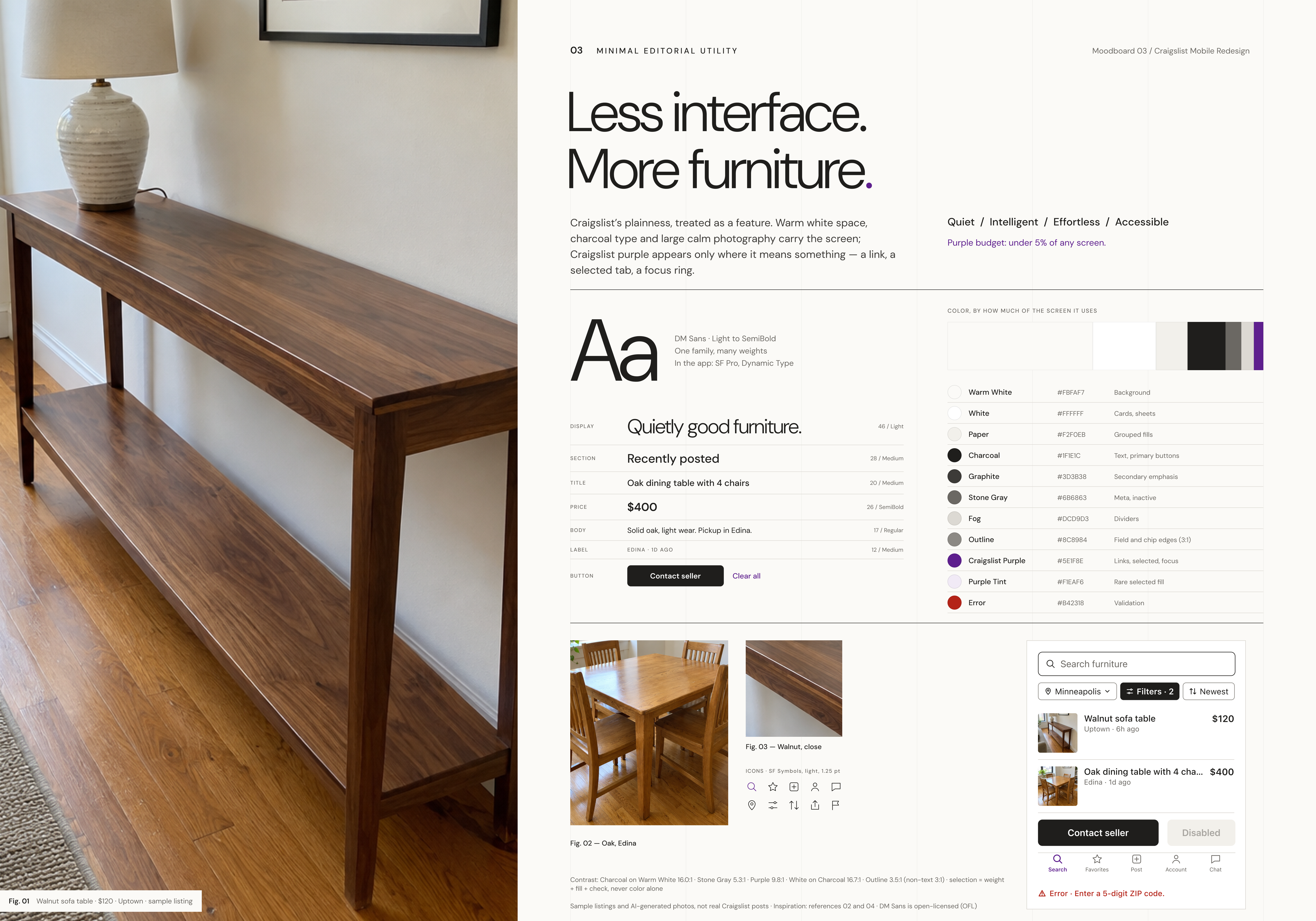
Visual exploration.
Figma source: Moodboard direction 3 (opens in a new tab)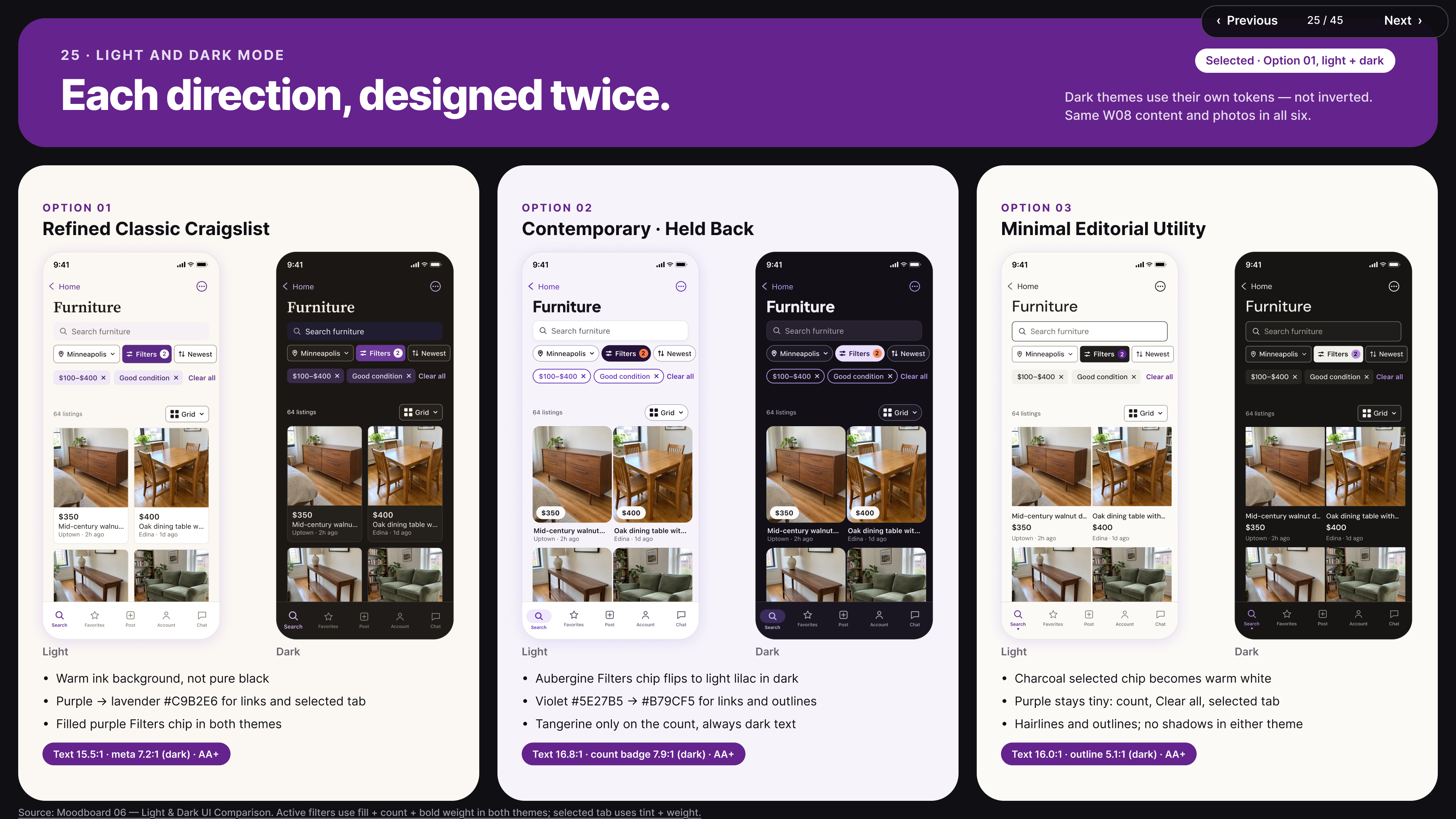
The approved visual direction.
Figma source: Option 01 — Refined Classic, Light and Dark (opens in a new tab)09
Design system
A scalable Figma system with foundations, components, states, variants and Light/Dark variables.
| Mobile screen width | 390 px |
|---|---|
| Mobile horizontal margin | 24 px |
| Content width | 342 px |
| Page-level section spacing | 40 px |
| Title-to-subtitle gap | 12 px |
| Bottom outer margin | 0 px |
| Tab bar | Flush to bottom |
| Tab bar structure | Five equal 78 px tabs |
| Tab content | Centered |
| Filter chip height | 44 px |
Component coverage
Navigation bars, tab bar, search fields, filter chips, listing cards, sheets and modal controls, text fields, segmented controls, listing-detail facts, photo gallery controls, contact actions, loading and skeleton states, empty and error messages, button and icon states — in Light and Dark.
Accessibility considerations are documented in the system; not all native accessibility behaviors were tested on a device.
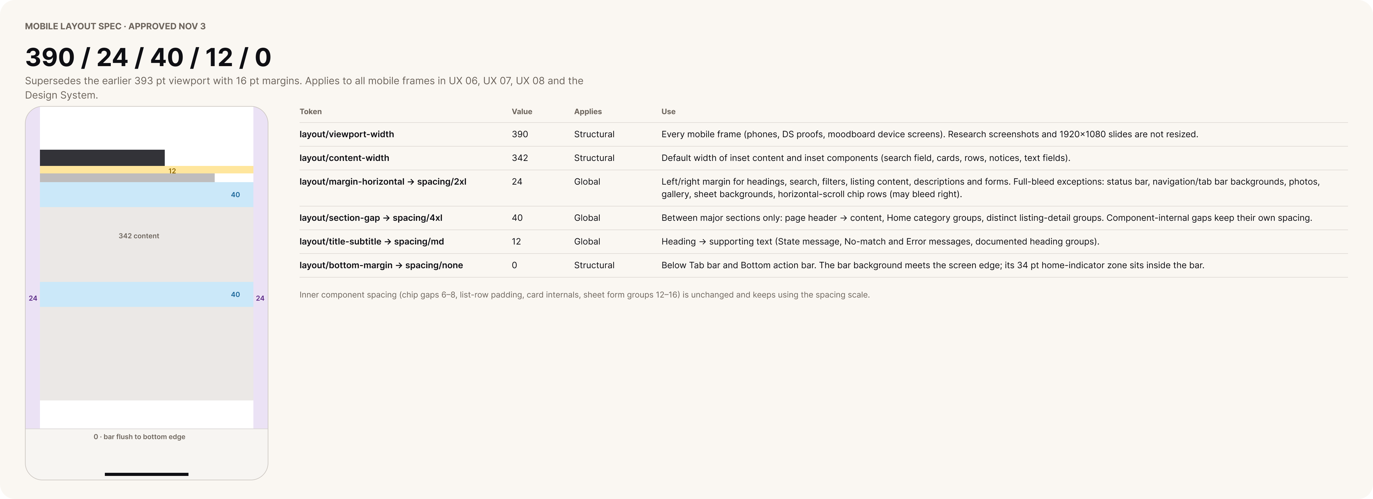
Approved spacing standards.
Figma source: Layout specifications (opens in a new tab)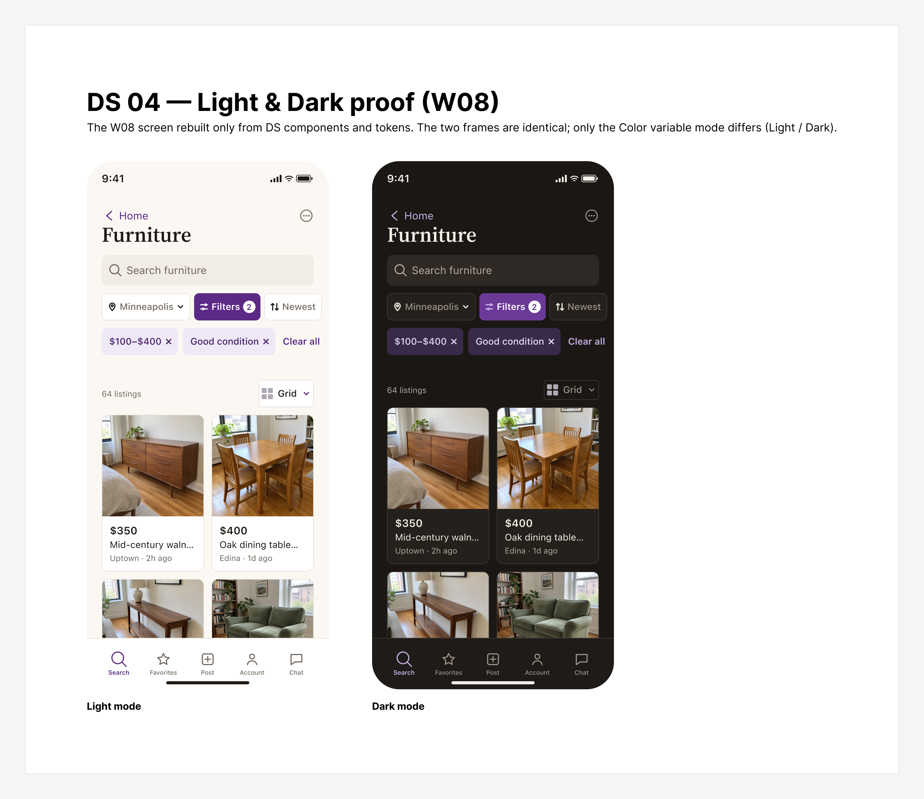
Reusable components across appearances.
Figma source: Core components, Light/Dark (opens in a new tab)10
Final UI design
An image-rich native iOS concept that keeps Craigslist recognizable while clarifying hierarchy and navigation.
Clarity without unnecessary reinvention
Preserve familiar navigation and recognizable categories.
Photography supports discovery
Improve browsing clarity without inventing unsupported seller information.
Privacy remains visible
Use approximate location appropriately; never imply unsupported precise distances.
Existing data is respected
Condition, delivery and other facts appear only when the listing contains them.
Contact is transparent
The contact sheet shows available options and authentication boundaries without claiming a message was sent.
Platform-native behavior
Respect safe areas, system navigation, expected sheet interactions and both appearance modes.
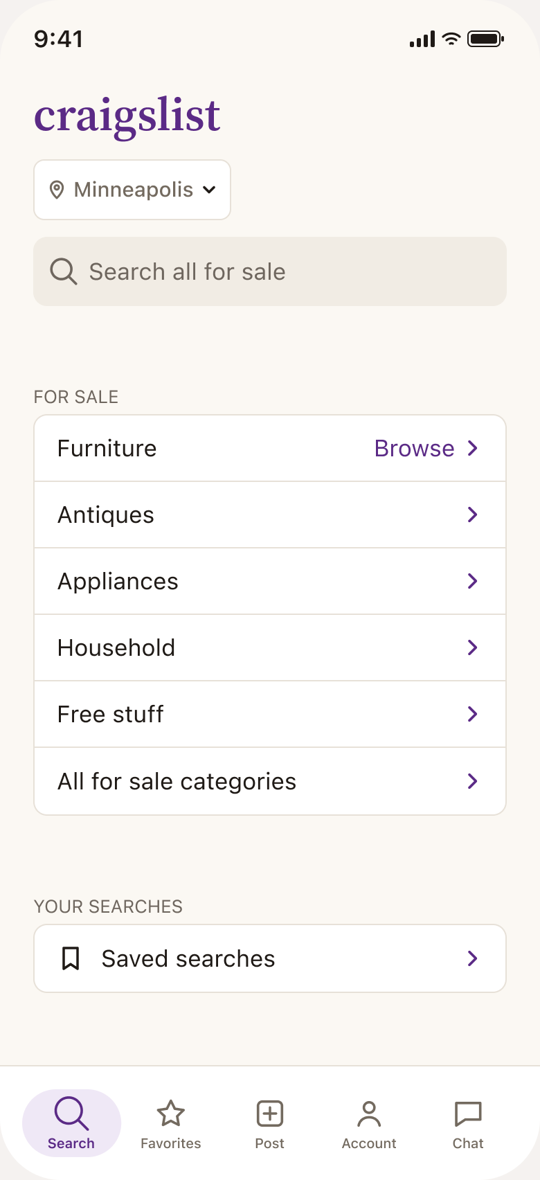
Final UI, Light and Dark.
Figma source: General Home (opens in a new tab)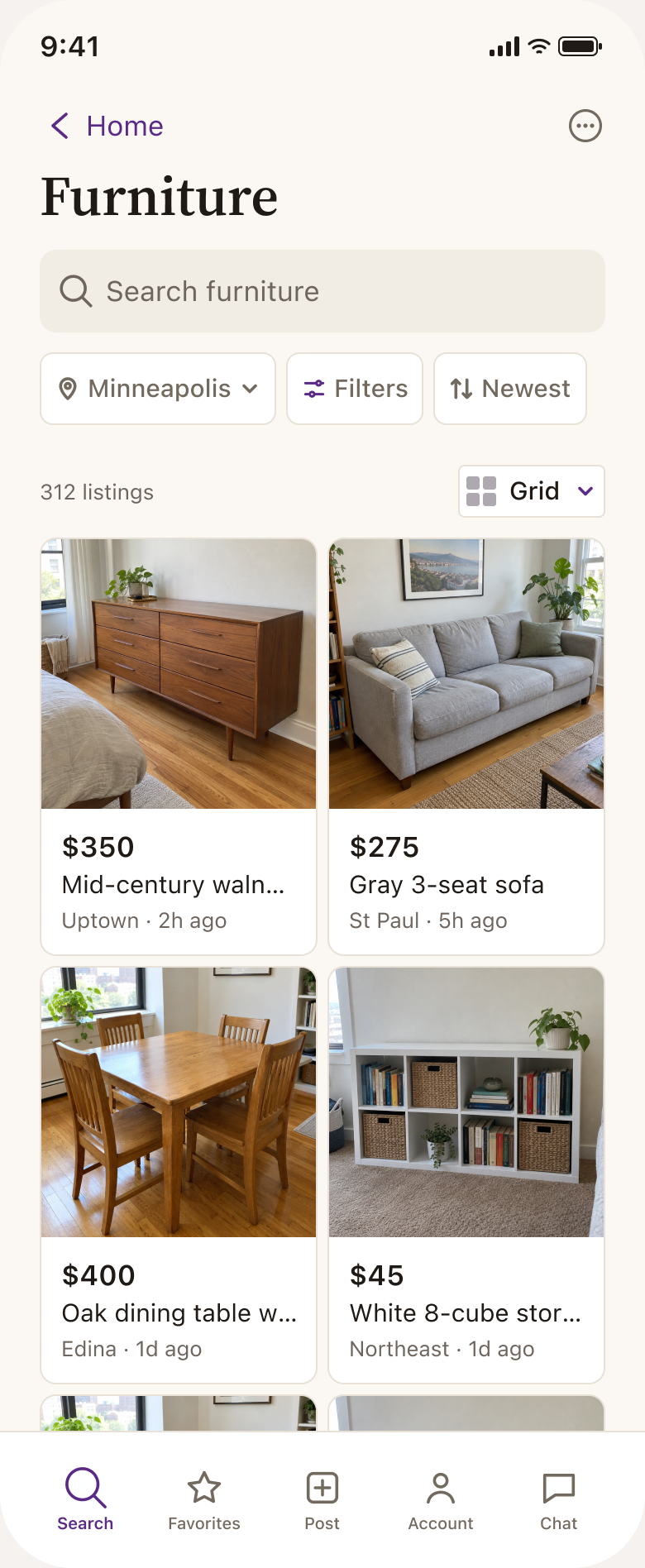
Final UI, Light and Dark.
Figma source: Furniture listings (opens in a new tab)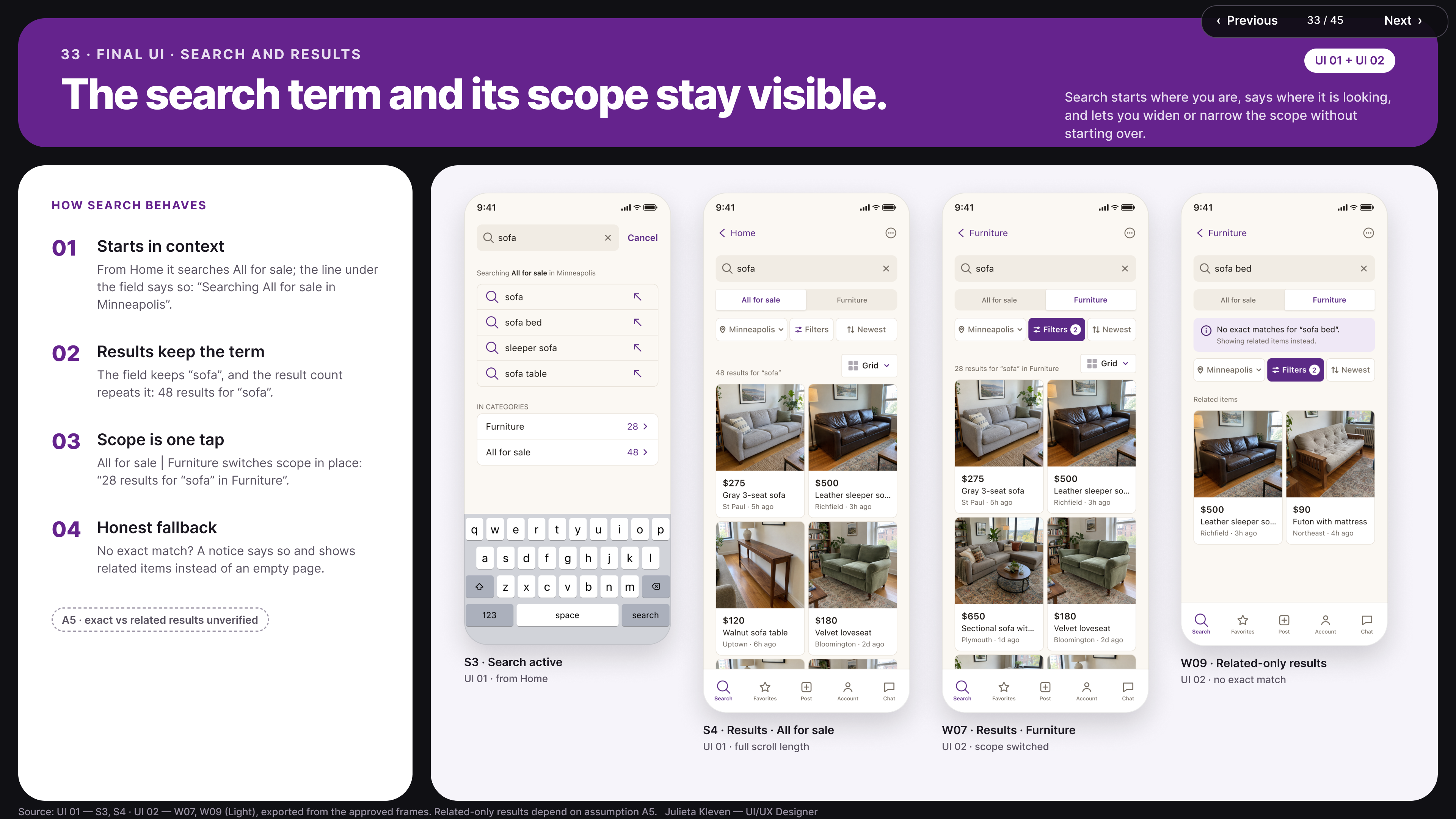
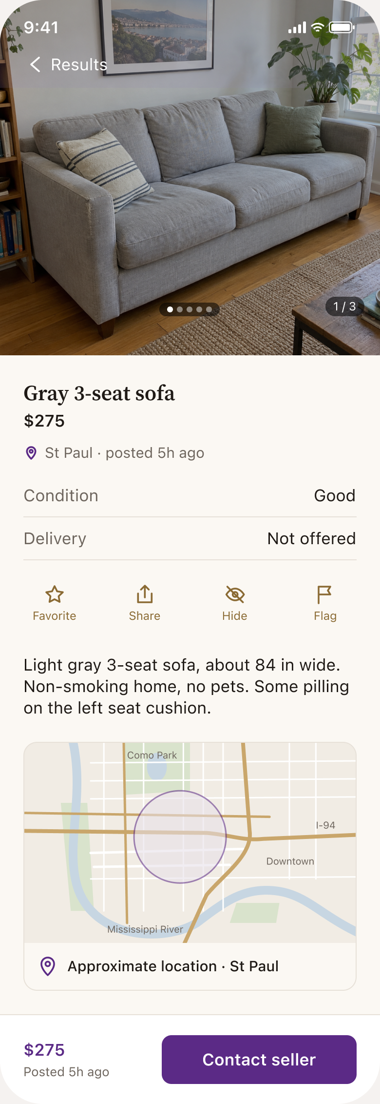
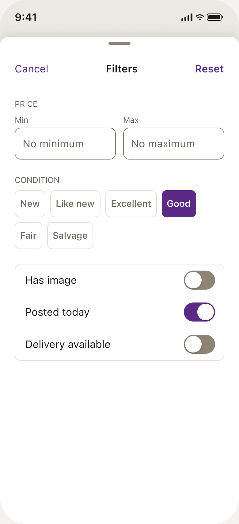
Supporting screens.
Figma source: Filters, sort & viewing modes (opens in a new tab)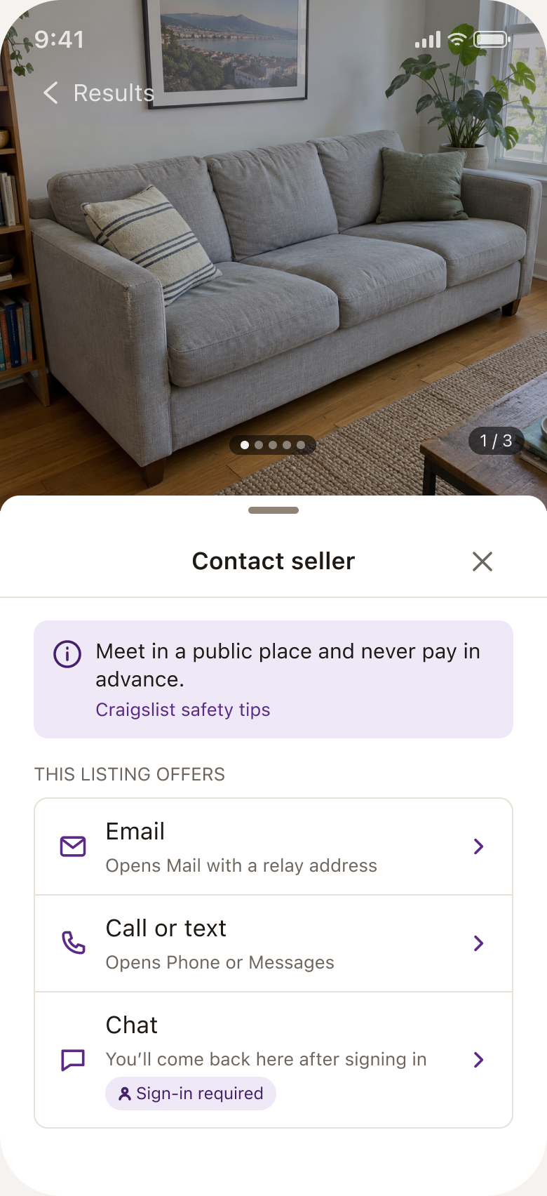
Contact options sheet.
Figma source: Seller contact (opens in a new tab)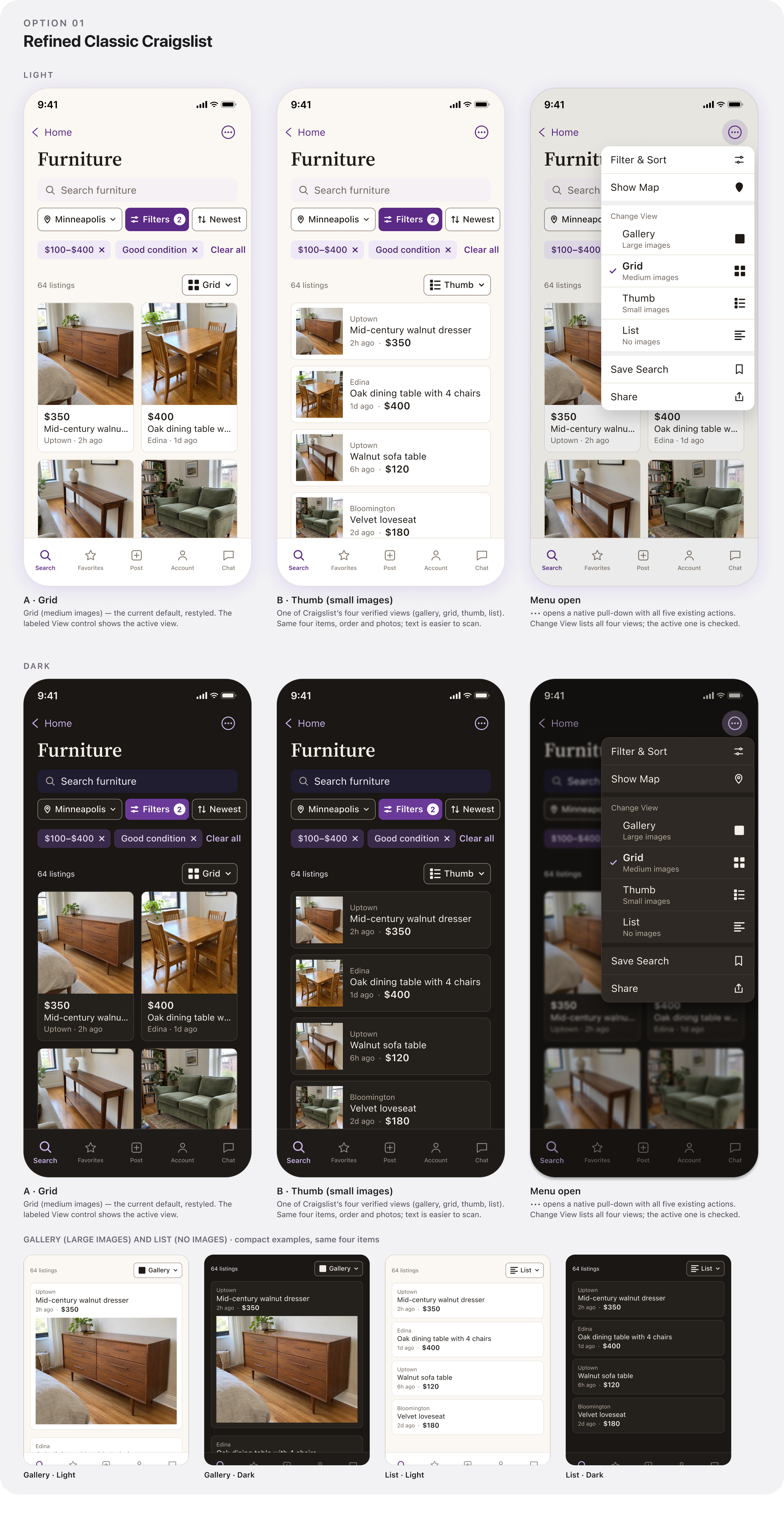
Sorting and listing-view modes.
Figma source: Sorting & viewing modes (opens in a new tab)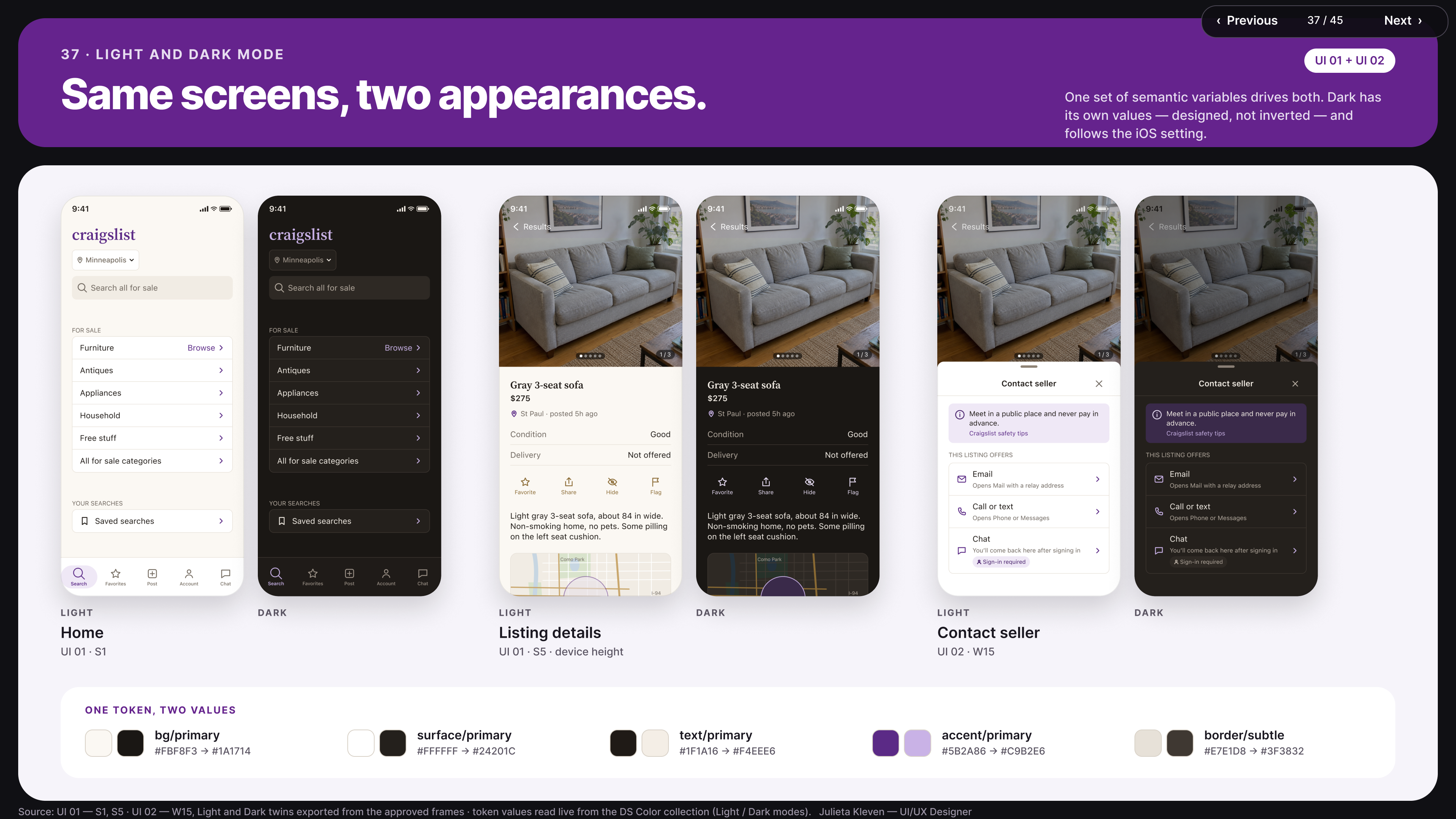
Light and Dark parity.
Figma source: Light/Dark comparison (opens in a new tab)11 — Interactive prototype
One starting experience connects every flow.
The Master Interactive Journey links General Home, category browsing, search, filtering, sort, listing-view changes, listing details, photo gallery, contact-seller examples and recovery states — in Light and Dark Mode. Demo shortcuts belong to the presentation experience, not the product interface.
This is a working Figma interaction model — not a published app or live Craigslist backend. No real transactions or seller communications were implemented.
Launch Interactive Prototype (opens in a new tab)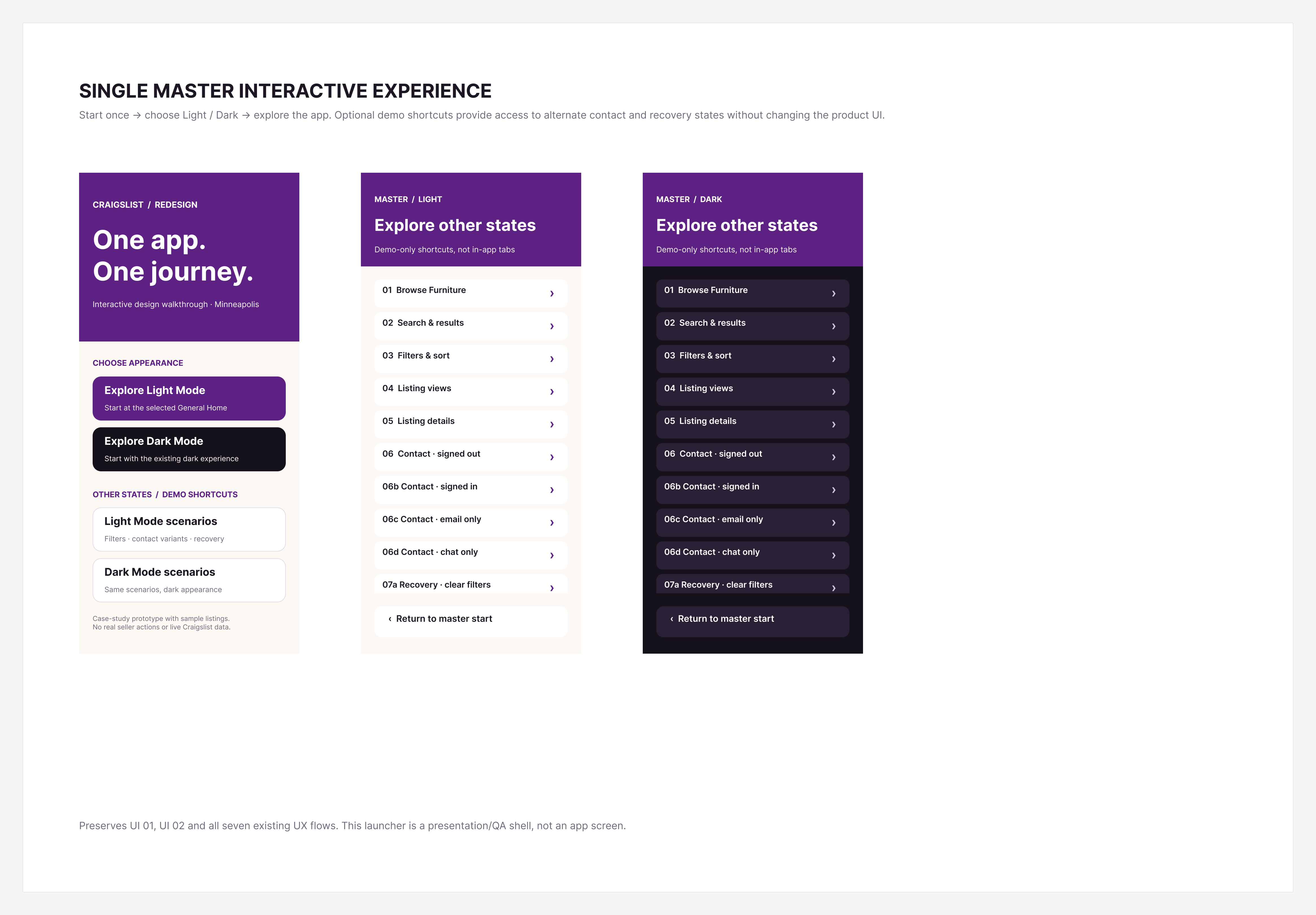
One starting experience connects every flow.
Figma source: Prototype journey (opens in a new tab)12
Tradeoffs & design decisions
The strongest decisions were often about what not to change.
Existing categories
Kept Craigslist’s seven main categories instead of inventing a simplified taxonomy, so existing users keep their mental model.
Five-tab structure
Retained Search, Favorites, Post, Account and Chat; global navigation changes were outside the assignment’s scope.
Listing privacy conventions
Approximate location and transparent contact options preserve the privacy and safety cues the evidence supported most.
Four listing-view modes
Gallery, Grid, Thumb and List were verified in the app and kept rather than replaced.
Existing user expectations
Improvements target clarity and hierarchy within familiar patterns instead of a new marketplace experience.
13
Outcomes & validation plan
From research to a connected product experience.
This is a design case study, not a launched product — there are no measured post-launch results.
Design deliverables — completed
- 15 documented heuristic findings
- 38 coded public-review records
- Seven documented UX flows
- Progressive wireframe development
- Three moodboard directions
- One selected visual direction
- A documented Light/Dark design system
- Final native iOS UI concepts
- A connected master prototype
- A complete research-to-design presentation
Proposed validation metrics — not yet measured
- Category-discovery task success
- Time to locate relevant listings
- Search reformulation frequency
- Filter discoverability
- Search-to-listing progression
- Listing-detail comprehension
- Seller-contact initiation success
- Confidence in privacy and location information
- Accessibility task completion
Design QA covered wireframe-to-UI consistency, preserved manual corrections, viewport widths, safe areas, navigation destinations, linked prototype frames, Light/Dark parity and component consistency. A production-level QA program or formal usability test has not been completed.
14
Tools & process
UX and UI design
- Figma
- Figma AI
- Figma Slides
- Figma interactive prototyping
Research & evaluation
- Existing Craigslist iOS app, OfferUp, Airbnb and Lyft
- Publicly accessible reviews and product references
- Perplexity — market-research assistance
- Claude — research synthesis, documentation and workflow assistance
- ChatGPT — research, design critique, planning and UX direction
All design decisions and approved manual corrections belong to Julieta Kleven. AI tools supported analysis, organization, exploration and documentation; they did not validate the project.
Closing-slide tools artwork from the secondary presentation file.
Figma source: Tools used (opens in a new tab)15 — Closing reflection
The redesign demonstrates how thoughtful, evidence-informed improvements can make an established product feel clearer and more approachable without replacing the familiar patterns its users depend on.
Closing slide from the case study presentation.
Figma source: Closing visual (opens in a new tab)