Discover project
Halcyon
Fintech
Transforming Risk Insights into Clear, Actionable Dashboards
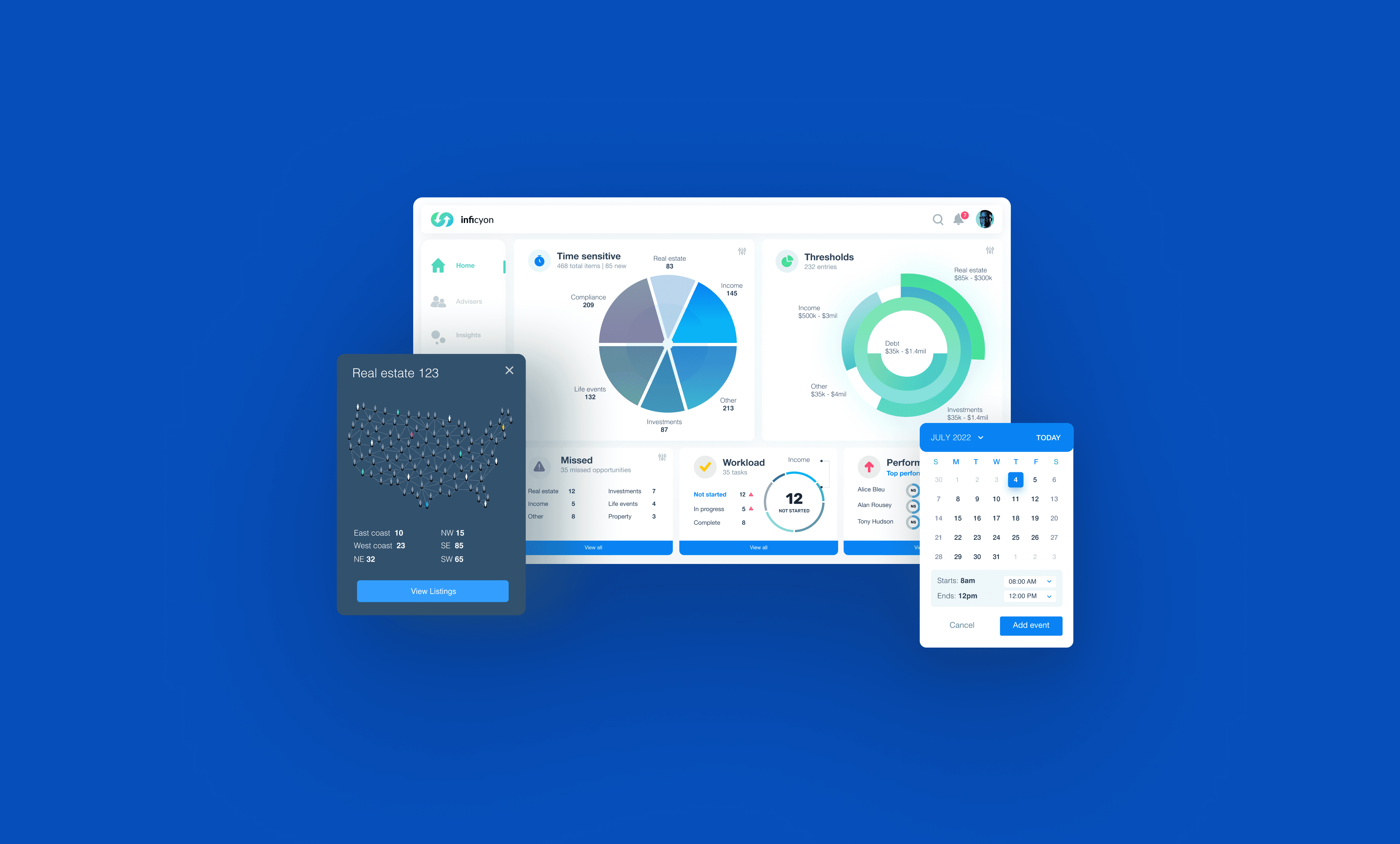
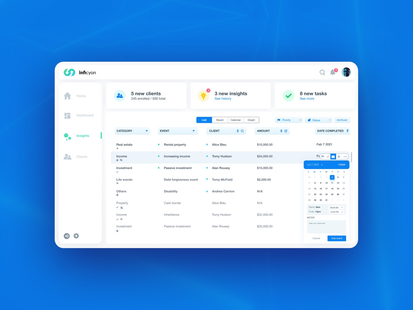
Halcyon is a financial insights platform that brings managers, advisors, and admins into a unified dashboard. It surfaces predictive insights, simplifies opportunity identification, and helps teams increase revenue through real-time, data-driven recommendations.
key
responsibilities
- UI Design
- Interaction Design
- Wireframes & Prototyping
- Design System Documentation
- Dashboard & Data Visualization Support

Project overview
Halcyon serves financial institutions, tax professionals, and advisory teams through a real-time insights platform designed to support collaboration and performance tracking.
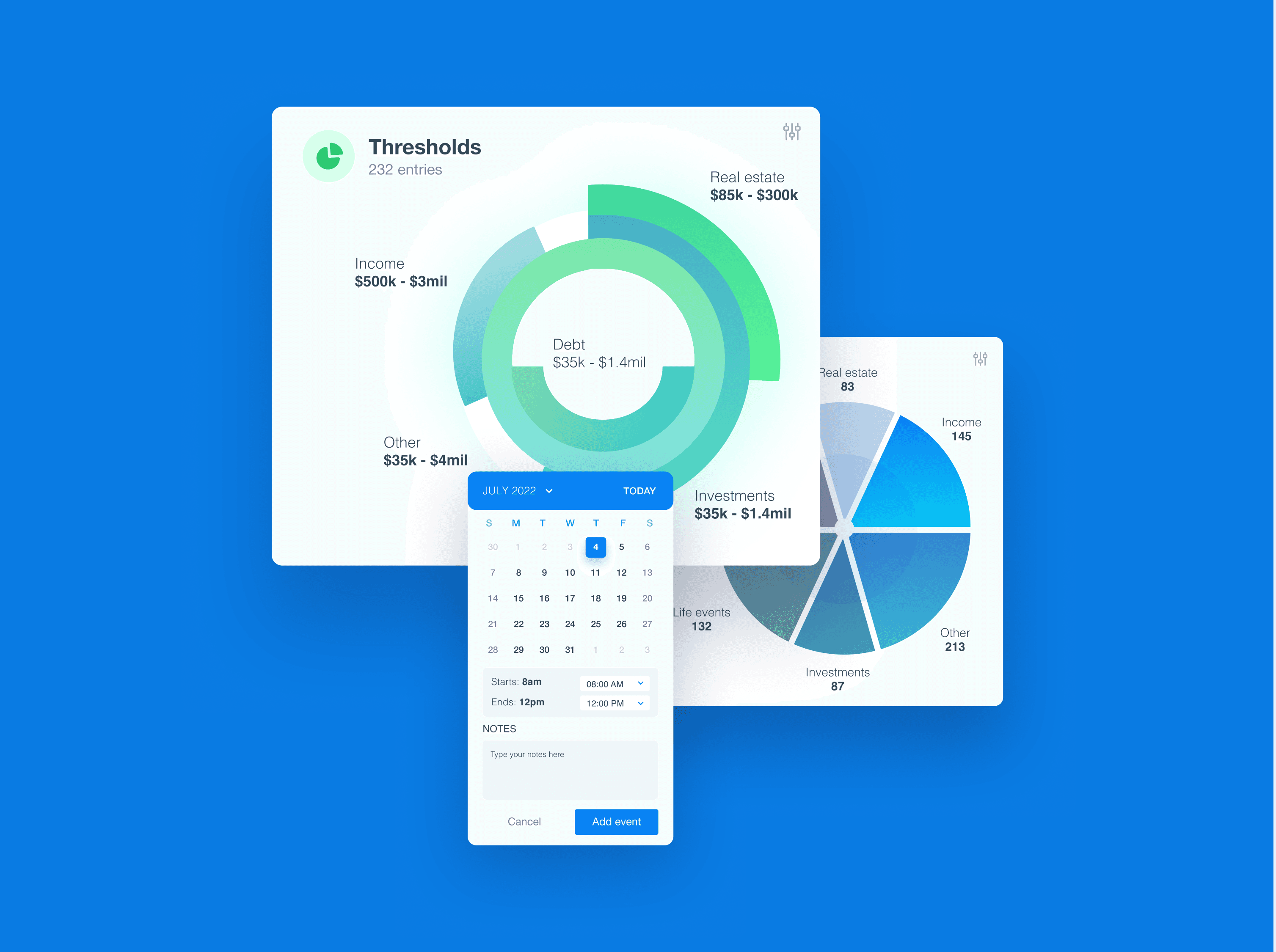
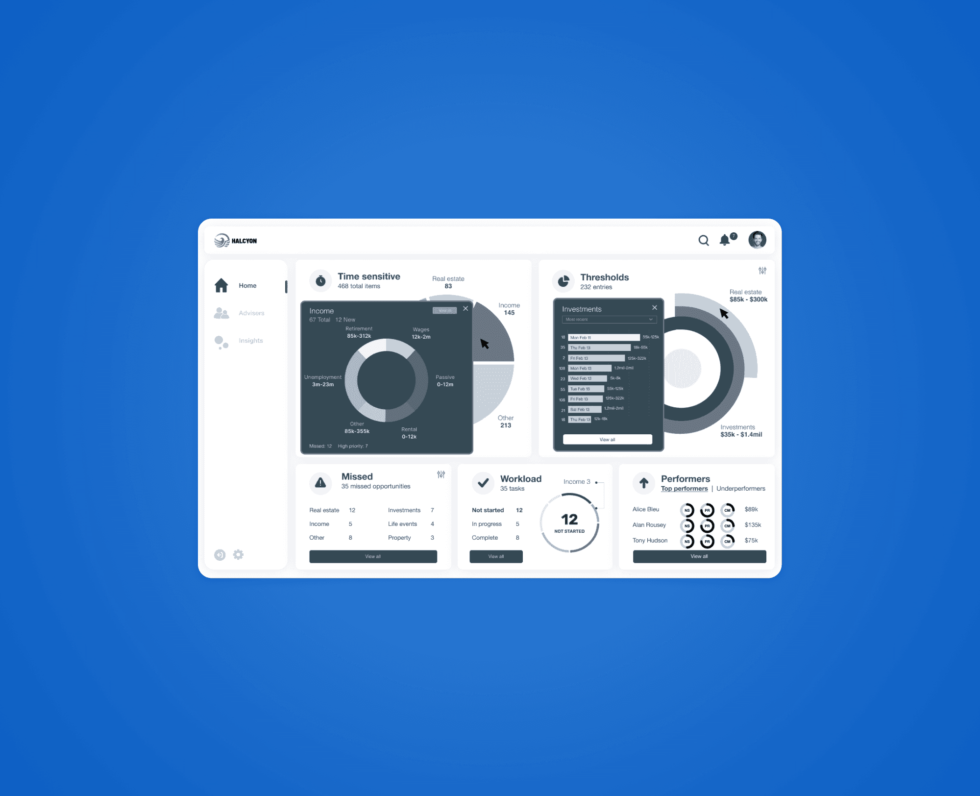
The platform's dashboards were fragmented, unclear, and difficult for teams to interpret. It resulted in low engagement, limited visibility into advisor performance, and missed opportunities for revenue generation.
My design philosophy is to build experiences that feel natural, are easy to access, and rooted in empathy.
Process
My process blends research, design craft, and close collaboration to deliver strong, high-quality outcomes.
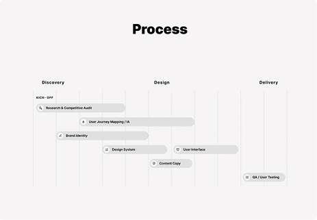
Setting the scene with the production team
I started by identifying friction across onboarding, daily use, and ongoing tracking.
From there, I simplified user flows, moved from early wireframes to UI, and worked closely with product and engineering to refine the experience through usability testing.
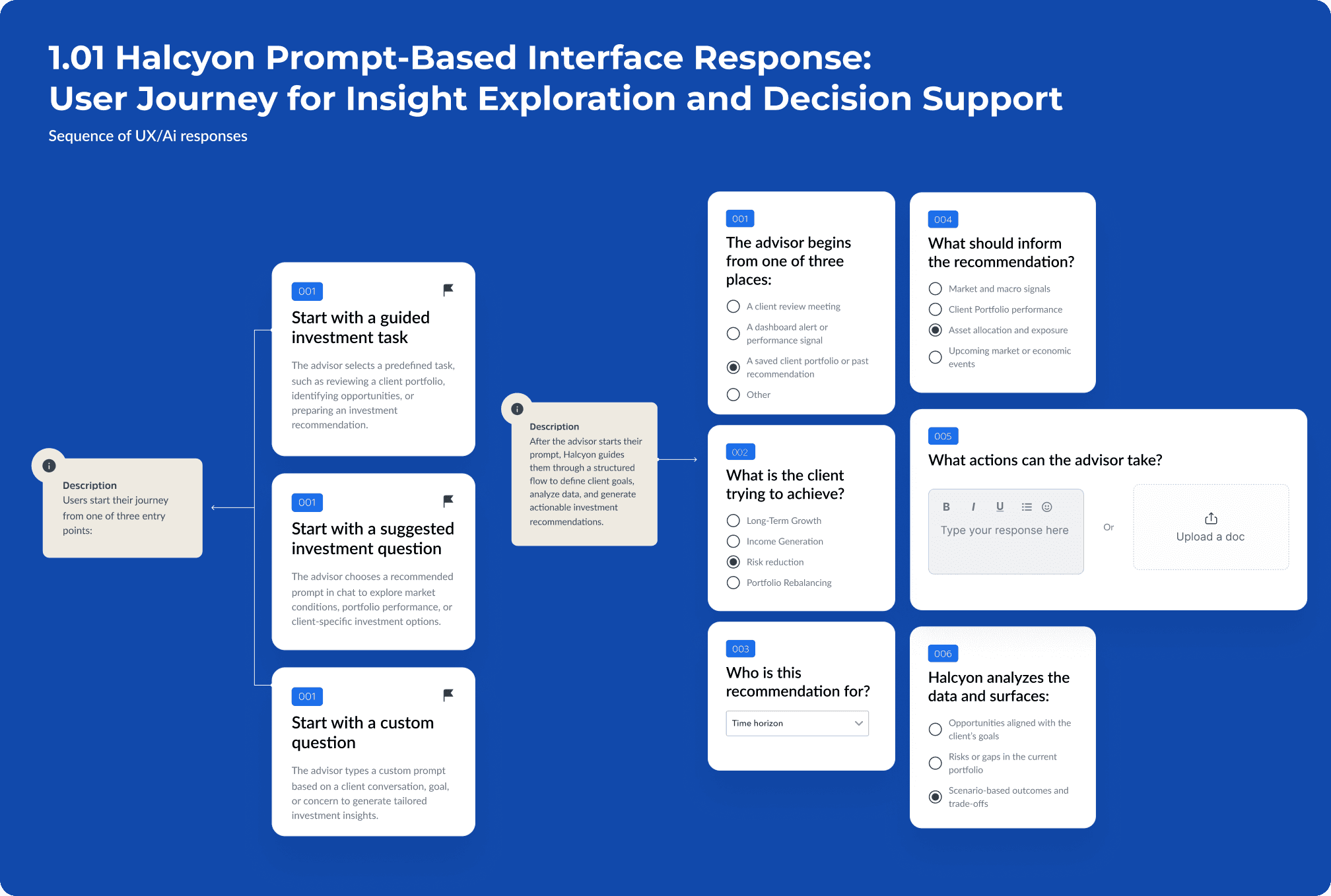
User Flows
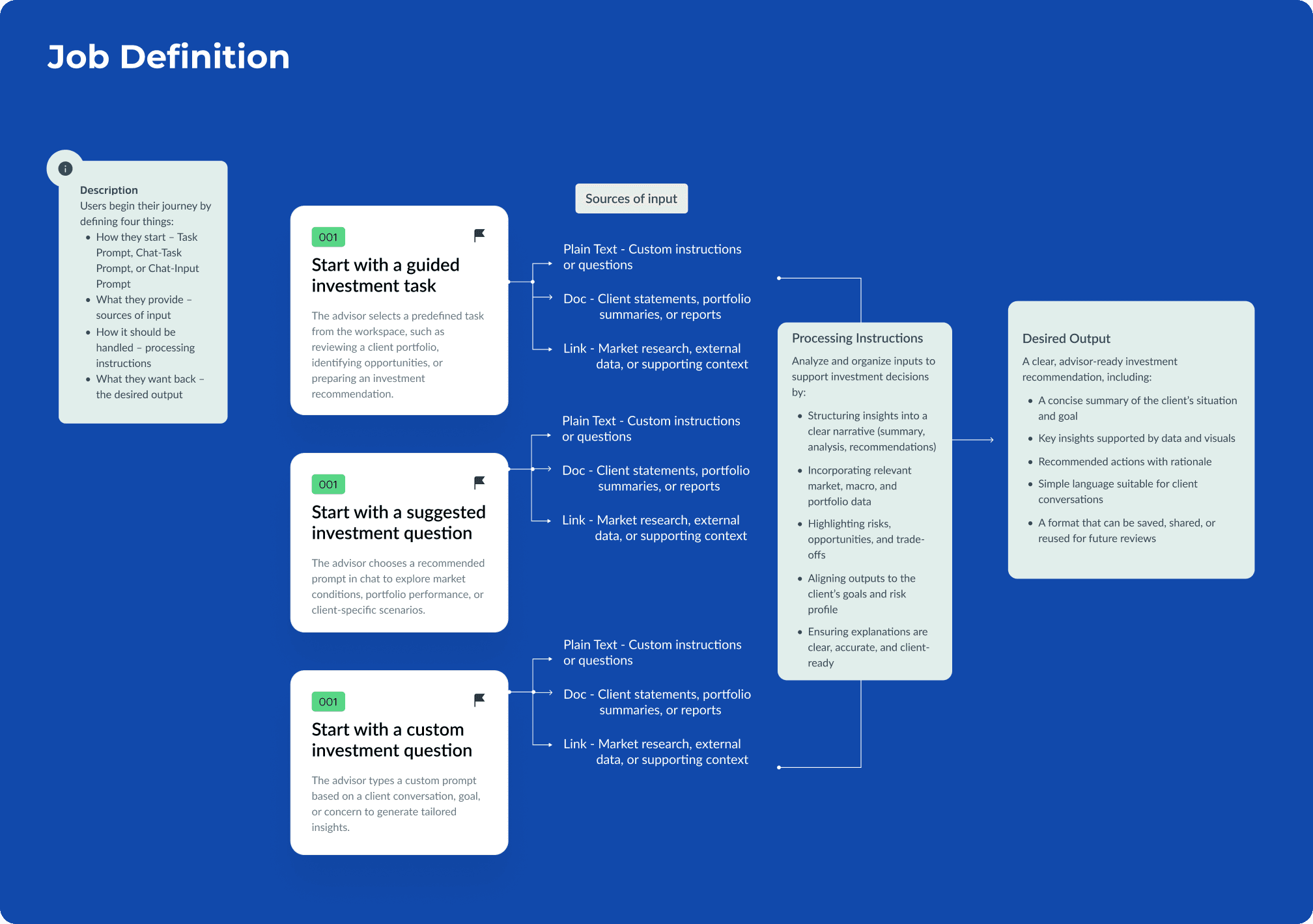
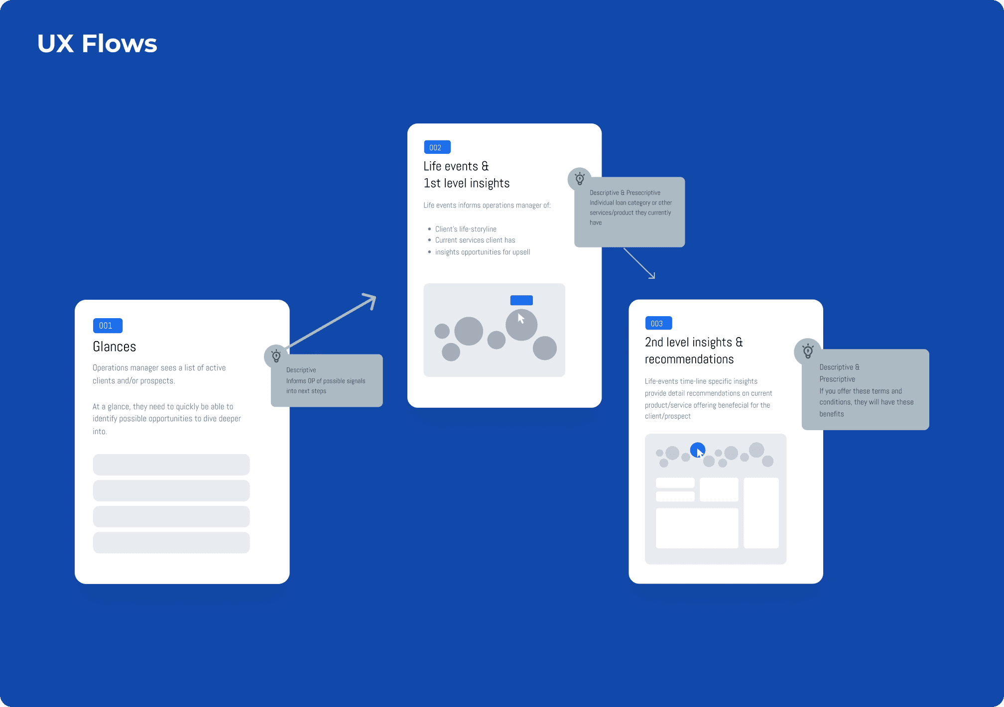
This user flow maps how teams move from an initial question or signal into a structured Halcyon workflow for insight discovery and decision-making.
It shows each step as Halcyon clarifies intent, surfaces relevant data, highlights predictive recommendations, and returns actionable outputs that can be saved and reused across teams.
Final Design
- Information Architecture
- Unified Design System
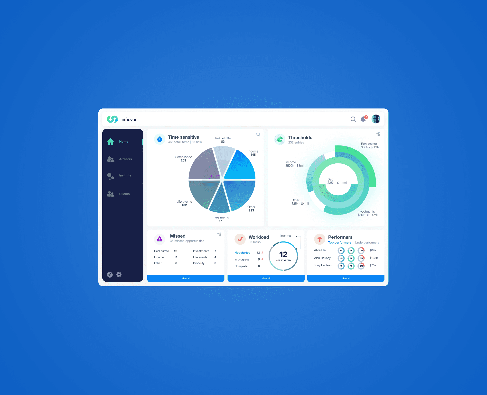
- Final User Interface Design
- Accessible Interaction Patterns
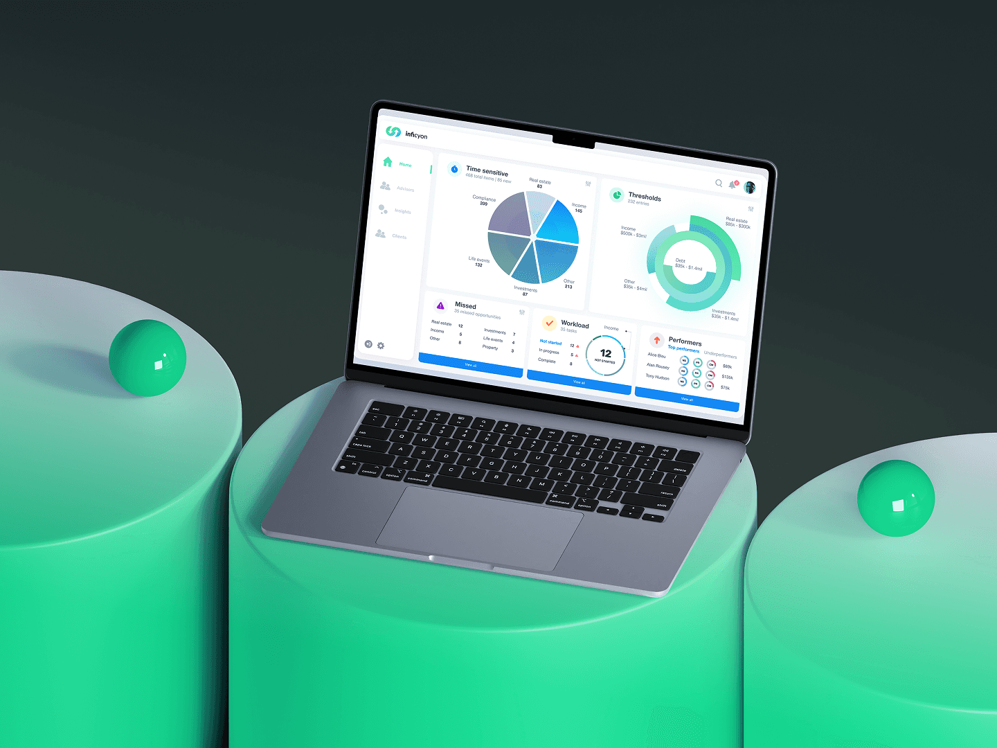
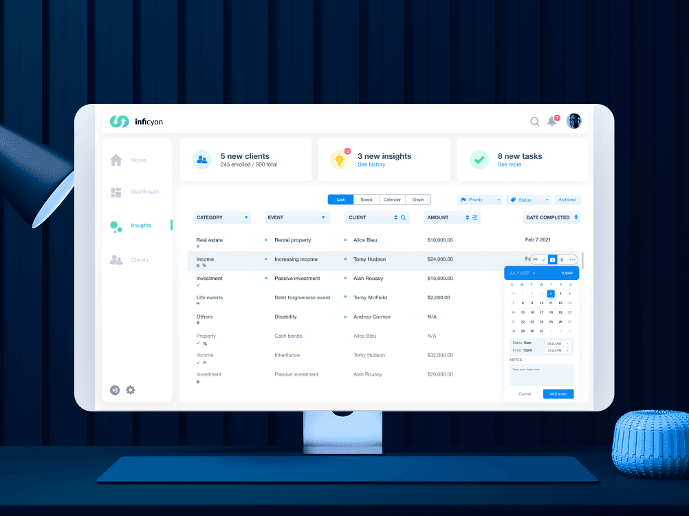
After refining it over time, the experience now feels easy, grounded, and genuinely pleasant to use. In the end, Halcyon feels simpler, calmer, and clearer—and users are more engaged because of it.
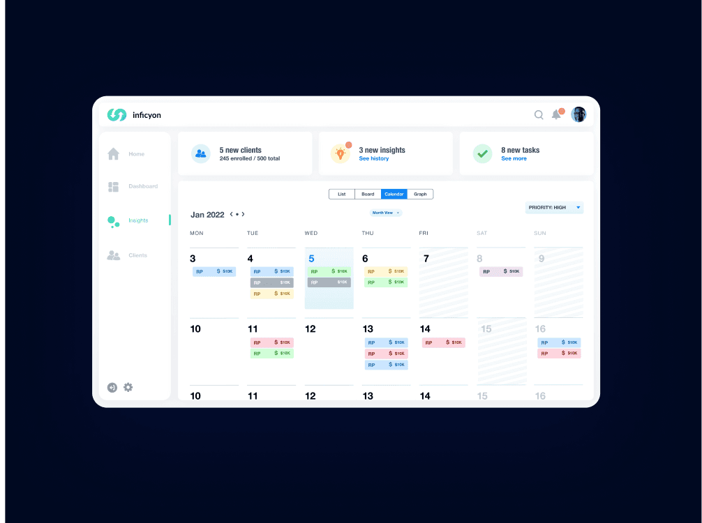
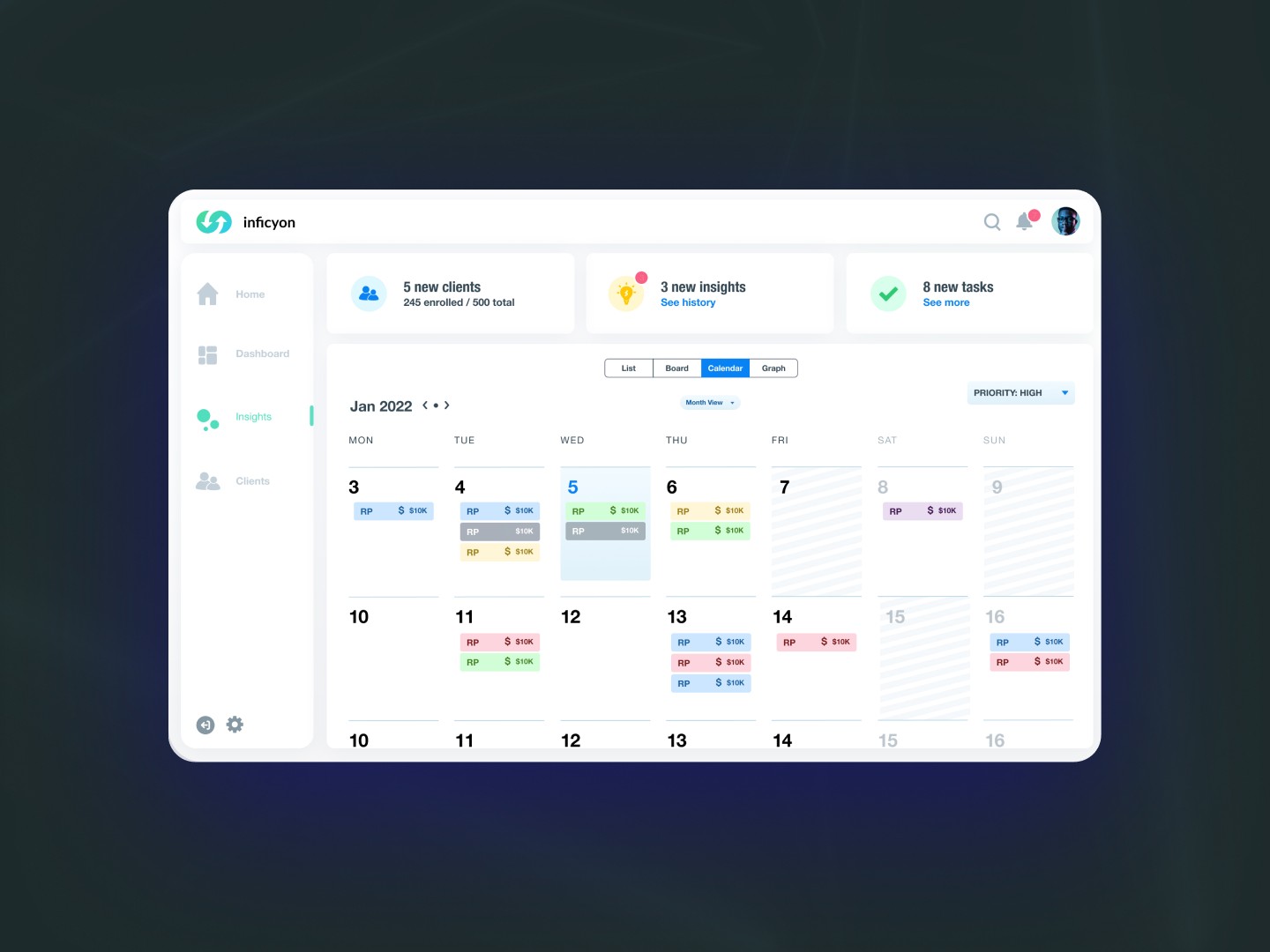
Achievements
“Julieta brought both empathy and precision to the Halcyon redesign. Her ability to translate emotional tone into functional design elevated the product experience far beyond our expectations.”
— Creative Director, Halcyon
After the redesign, we saw real improvements in how the product felt and how well it worked.
- Daily engagement increased by 28%
- Onboarding completion improved by 35%
- Analyst adoption grew to 65%
- Leadership visibility increased by 50%
- Faster design-to-development through reusable components
- Improved accessibility and readability across all devices
Daily Engagement
Daily Engagement: 28%
Onboarding flows
Onboarding flows: 20%
Analyst Adoption
Analyst Adoption: 40%
“Julieta brought both clarity and precision to the Halcyon redesign. Her ability to translate complex behavioral insights into intuitive, functional design elevated the platform and significantly improved the overall user experience.” - Creative Director, HALCYONHalcyon Case Study (opens in a new tab)
More projects
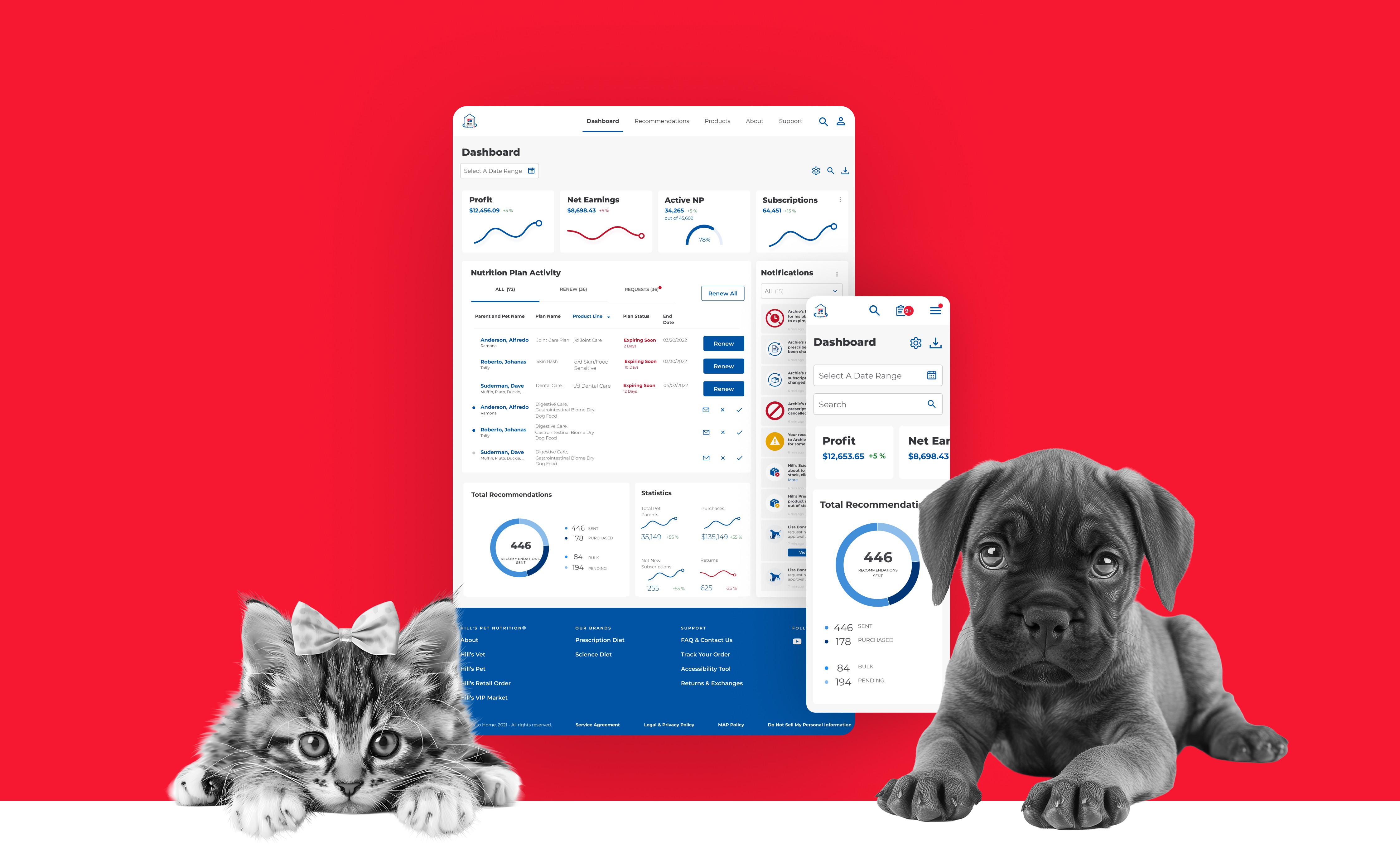
Colgate Palmolive / Hills to Home
Enterprise E-commerce
Bringing A Seamless Pet Care e-Commerce Experience
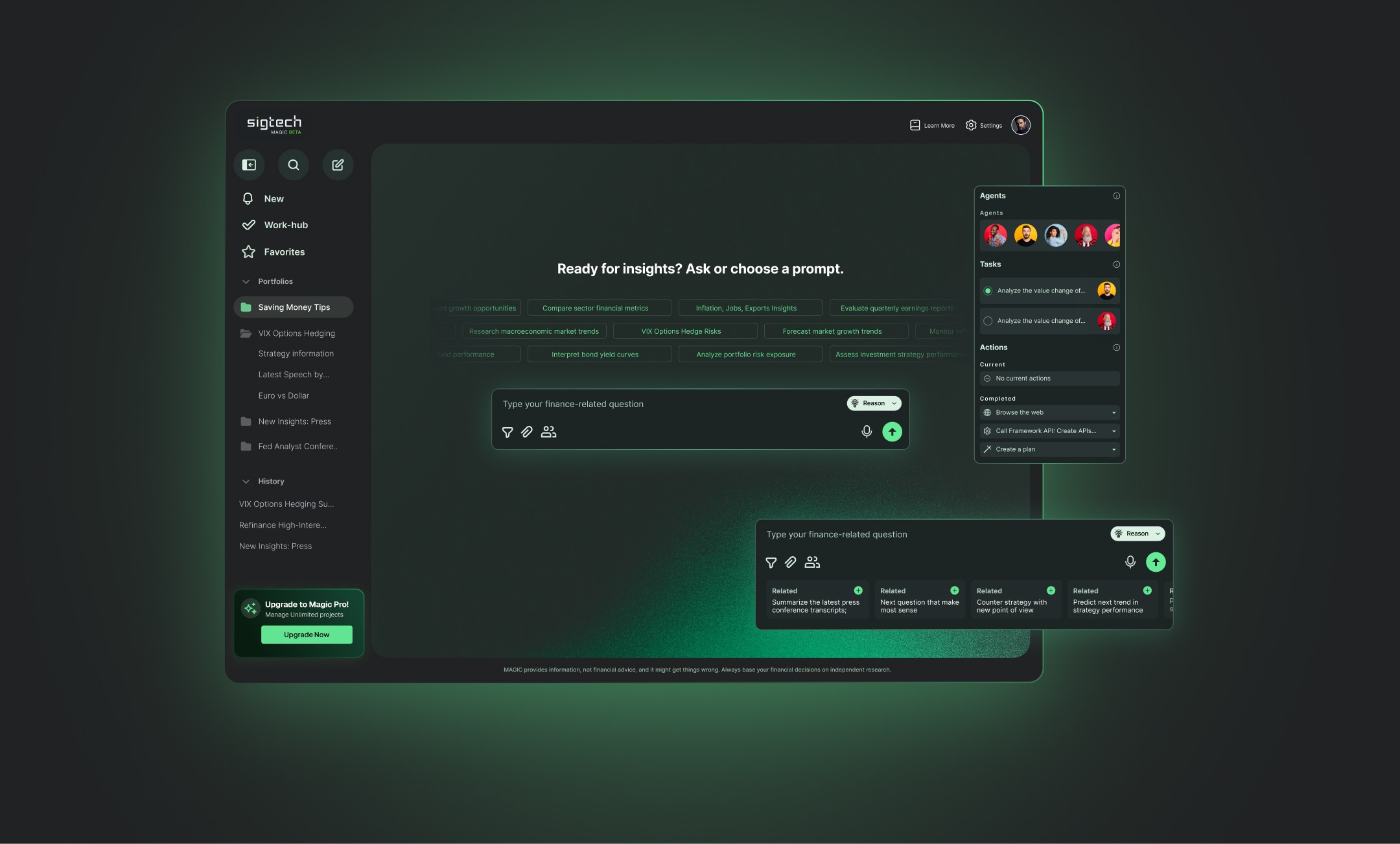
SigTech Magic
Fintech AI
Revolutionizing Fintech UX – 40% More Adoption
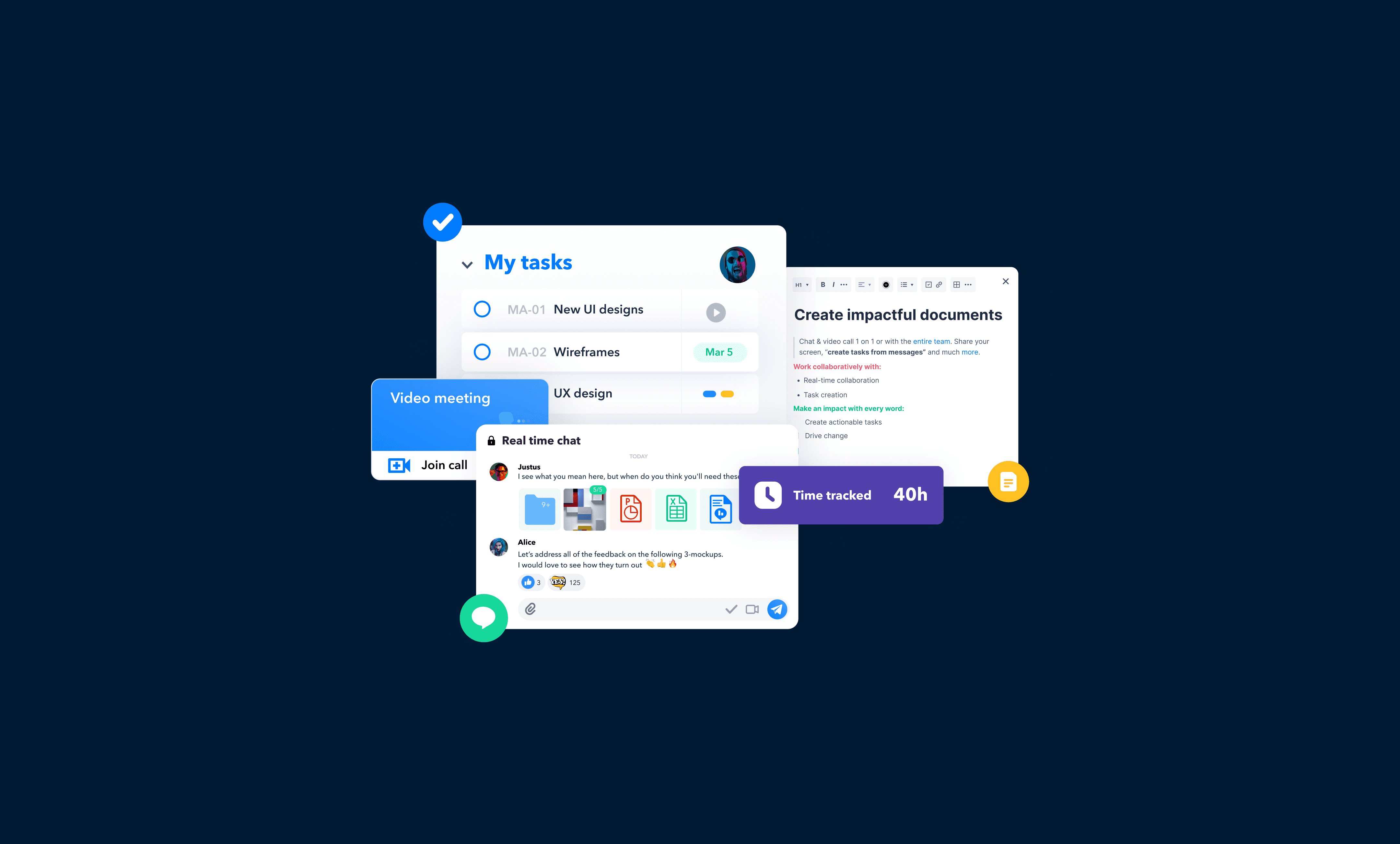
Heycollab
SaaS Project Management
Research, UX, UI Design System, Style Guide
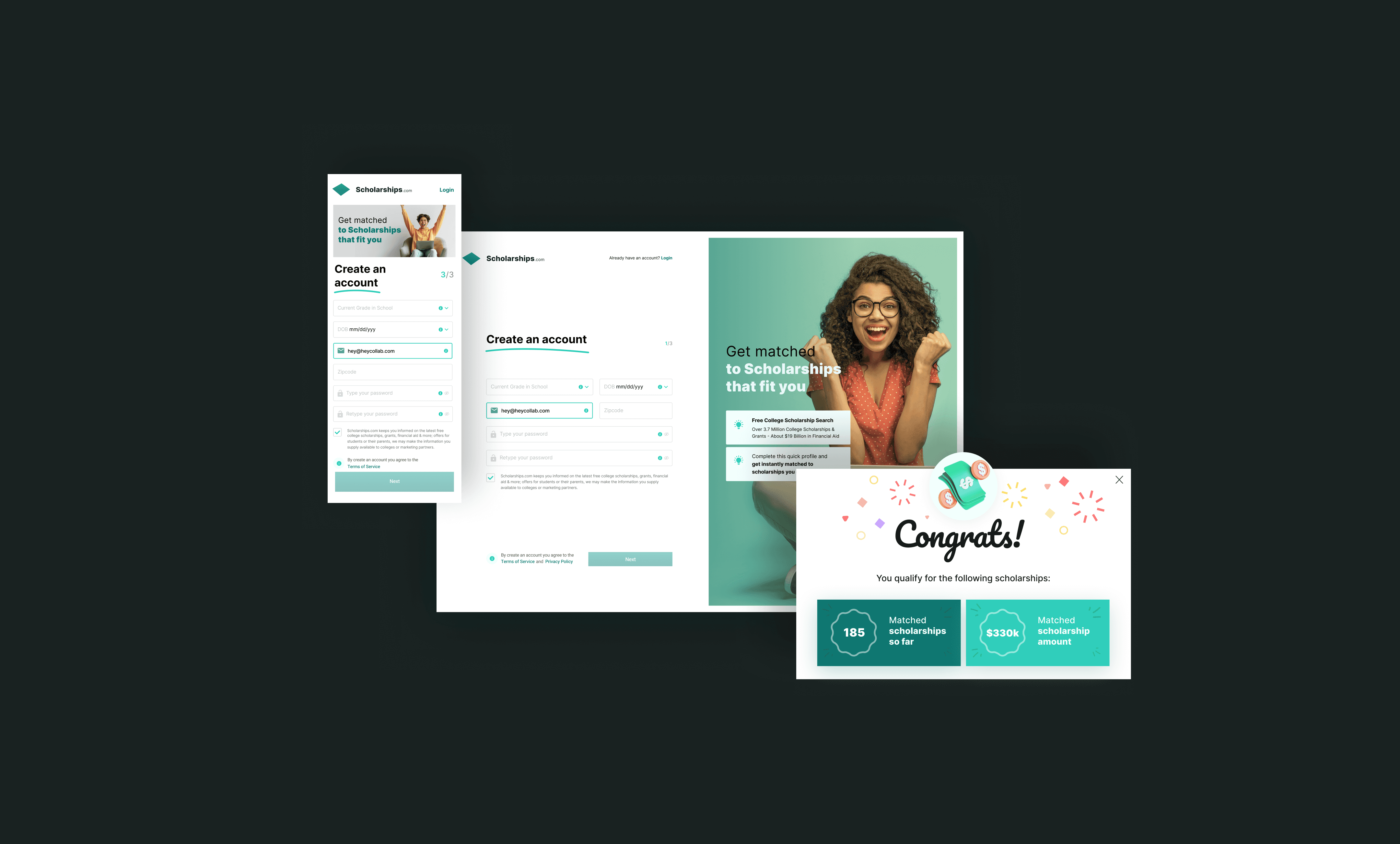
Scholarships.com
Education
Creating a student-first digital platform to simplify scholarship discovery and build trust.
IndiTV
Entertainment
Best Practices Audit, Research, UX/UI Design System