HillsToHome
Design System
I crafted intuitive digital experiences, elevating user interfaces with a focus on innovation and excellence.
Client:
Colgate
Date:
July 2020-March 2024
Role:
Senior UI & UX Designer
Preview:

Responsibilities
Owner & Contributor

Tools
Figma
Asana
Photoshop
Adobe Suite

Deliverables
Design Library
Component Guideline
Design Token
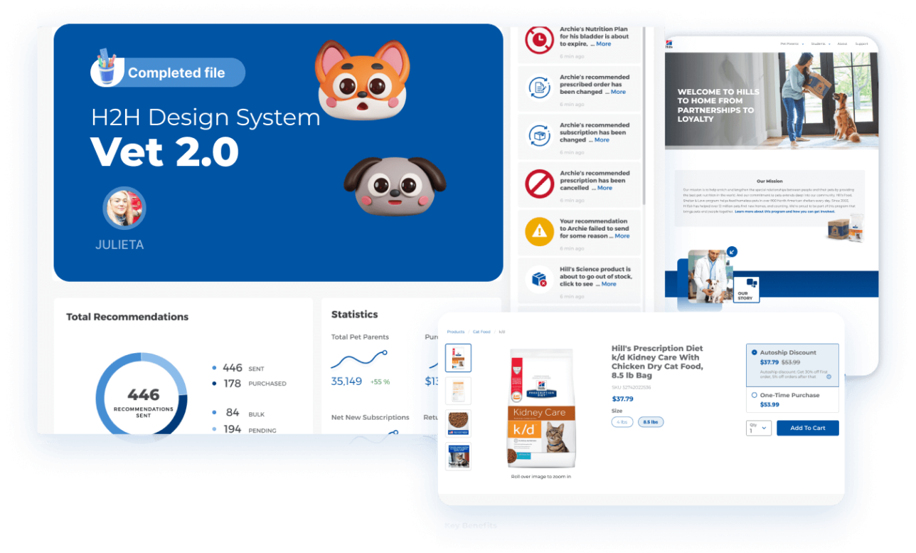
Company Overview
Hill’s Pet Nutrition, Inc., marketed as “Hills”, is an American pet food company that produces dog and cat foods. It was founded in 1907 by Burton Hill and started operation as Hill Rendering Works. By the 1930s, the name had changed to Hill Packing Company. In 1968, Hill Packing Company was sold to Rivana Foods, then in 1976 the Colgate-Palmolive Company merged with Rivana Foods and the company became its subsidiary.
Challenge
Colgate-Palmolive’s HillsToHome platform lacked a unified design system— components were inconsistent, styles weren’t standardized, and non-designers found it difficult to use or trust the existing library. This led to inefficiencies, design debt, and a fragmented user experience.
Proposed Solution
I rebuilt the design system from the ground up: audited and consolidated components, applied atomic structure, standardized tokens (typography, color, spacing), and documented usage in Figma. The result was a clean, scalable system accessible to designers, developers, and product teams alike.
My Approach to Design Systems
Understanding the competitors’ way of work, a research into their platform was necessary in order to help out with implementing a renewed look of the site but also getting the user’s input as we communicated with business department: robust, reusable system that supports consistent UI behavior, rapid prototyping, and accessible design for all users.
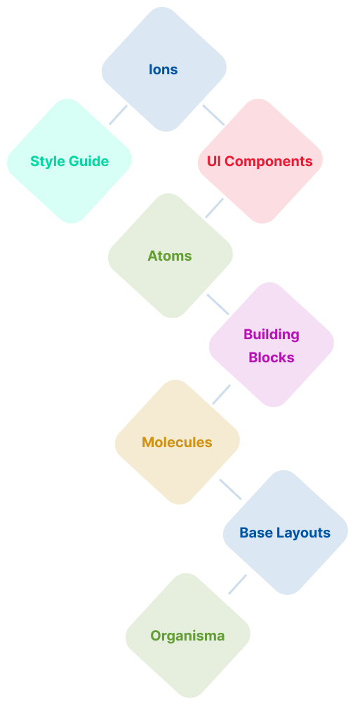
I structured the system around atomic design principles — from individual elements (Atoms) to complex layouts (Organisms). This modular strategy ensures scalability, adaptability, and collaboration across design and development teams.
Figma Structure Overview
The file is methodically organized into intuitive, role-based categories for clarity and efficiency:
Style Guide
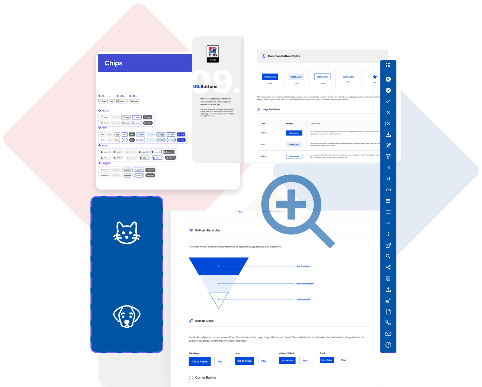
- Buttons & States – Interaction-ready styles with hover, active, and disabled states
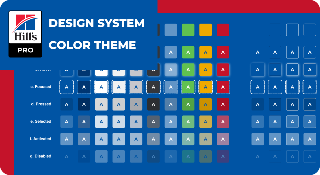
- Color – Primary, secondary, semantic, and neutral palettes
- Typography – Scaled system from XXXL to XXS with adaptive weights
- Grid, Spacing, Environment – Layout and spatial rhythm essentials
- Forms, Iconography, Media – Foundational elements for UI consistency

UI Components (Atoms)
- These are the smallest reusable units (e.g., buttons, toggles, avatars)
- Built with Figma variants and auto
Building Blocks (Molecules)
- Composite components like form groups, list items, and cards
- Structured to demonstrate real usage patterns
Base Layouts (Organisms)
- Full templates such as dashboards, modals, and mobile-first flows
- Demonstrates real implementation scenarios using system components
Why This Structure Works
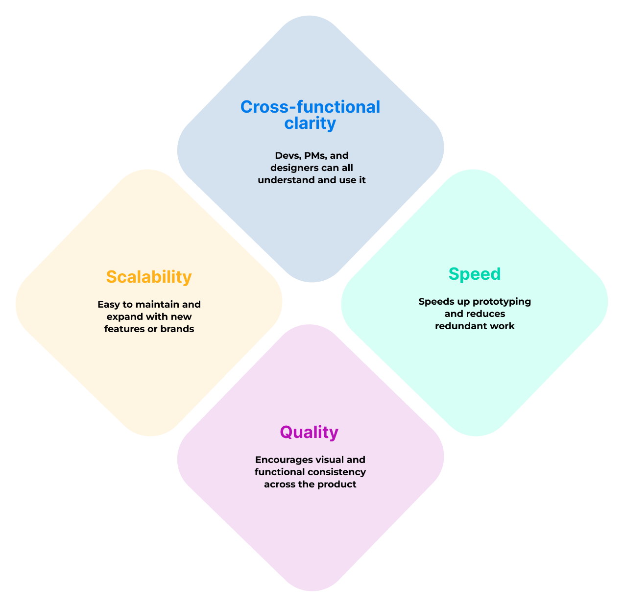
Impact
This system not only improved workflow speed and consistency but also enhanced accessibility and user satisfaction across the platform. Designers and developers now work from a single source of truth, reducing handoff errors and redundant styling.

What’s your approach to building a design system from scratch?
I start with an audit of the product’s existing UI, identify inconsistencies, and then build foundational tokens (colors, typography, spacing). From there, I follow atomic design principles to structure components and ensure accessibility, scalability, and ease of use across teams.
How do you support both designers and devs?
I use clearly named layers and variants in Figma, maintain component documentation, and structure the file for easy navigation. I also work closely with developers to align design tokens and make handoff seamless.
What makes your design systems scalable?
Reusability and modularity. Every component I create supports variant logic, follows spacing rules, and can adapt across different breakpoints or themes. I design with future growth in mind.
How do you maintain and update your design systems over time?
I set version control guidelines, collect team feedback regularly, and keep documentation visible in Figma. I also make system health part of regular design reviews.
Can I see one of your design systems in Figma?
Yes! You can view my sample design system here:


