Colgate
I crafted intuitive digital experiences, elevating user interfaces with a focus on innovation and excellence.
Client:
Colgate
Role:
Senior Designer, UI & UX Designer
Date:
July 2020-March 2023

Responsibilities
User Research
Comparative Research
User Persona
User Journey
Information Architecture
Design system
Wire-framing
Design System
Branding
User Interface
Prototyping
Usability Test

Tools
Sketch
Figma
Invision
Asana
Tools
Adobe Suite
Invision
Google Meet
Company Overview
Challenge
Proposed Solution
Process
Market research
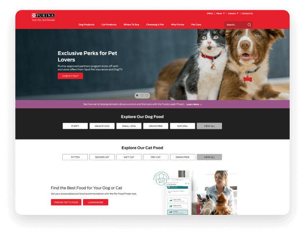
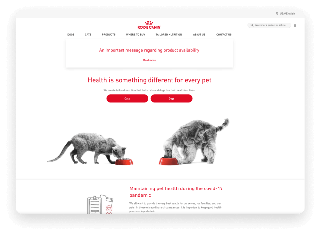
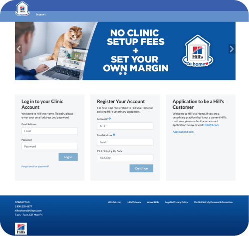
Understanding the competitors’ way of work, a research into their platform was necessary in order to help out with implementing a renewed look of the site but also getting the user’s input as we communicated with business department: Regal Canine and Purina sites were referenced together with the customers’ feedback.

Surveys
Interviews
Synthesis
Synthesis of data showed the following common issues:
- allowing the user to access the products prior to logging in – the user can add items to their cart (PP site and VP site)
- allowing the Vet to send recommendations and view their progress from dashboard
- allow the PP to send requests for prescriptions to their Vet
- allow the Vet to register a PP from their account
- revamp the site from a UI/UX experience
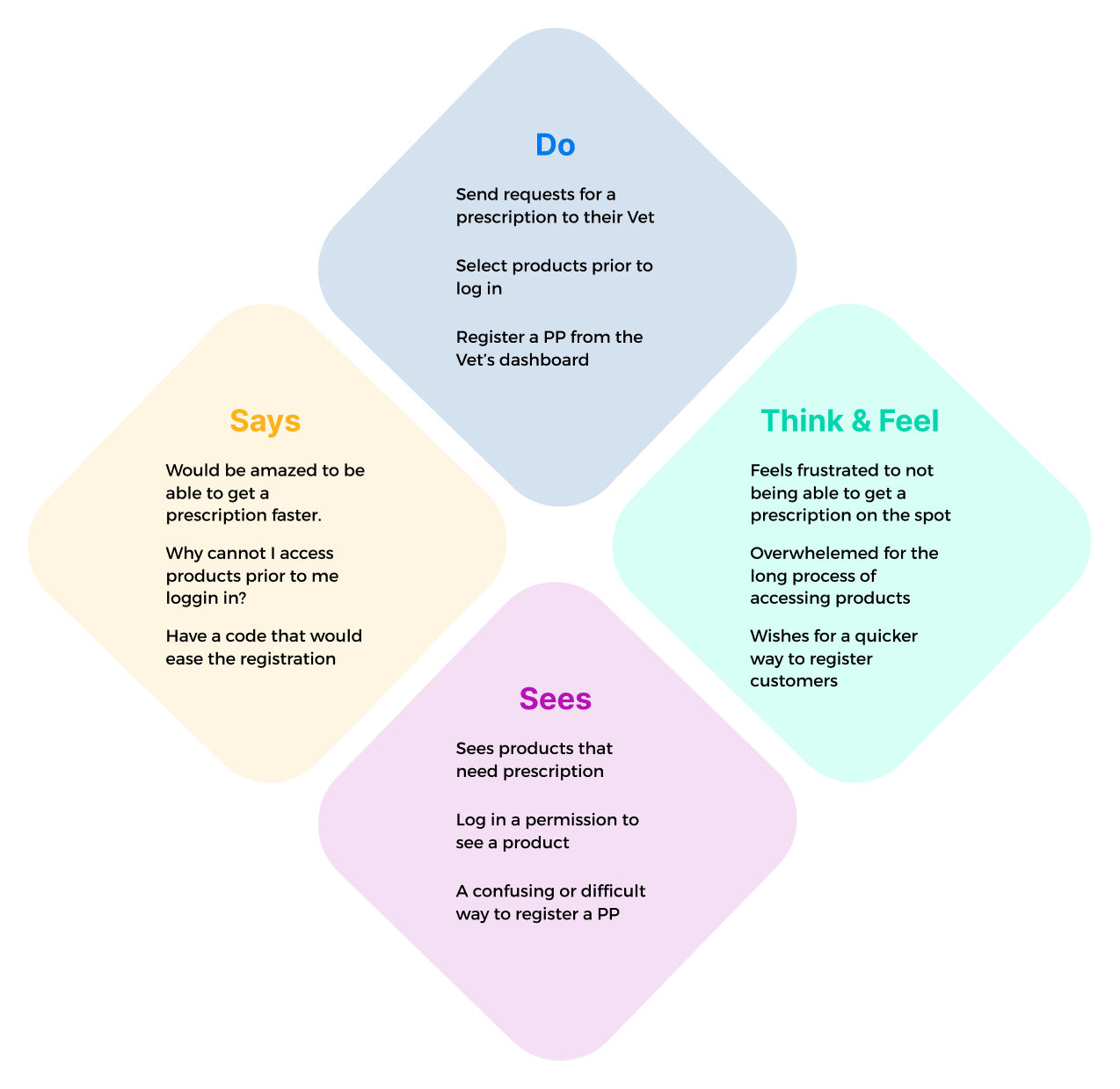
Empathy map
Organizing the Users’ pain points from the user interviews by:
- what they were thinking and feeling
- what they were seeing
- what they were saying
- what they were doing
This process helped organize each pain point by its characteristic.
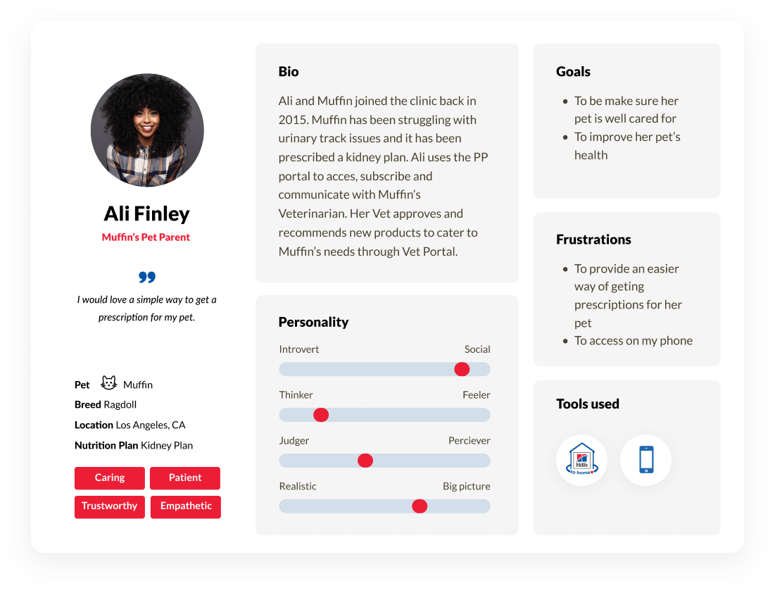
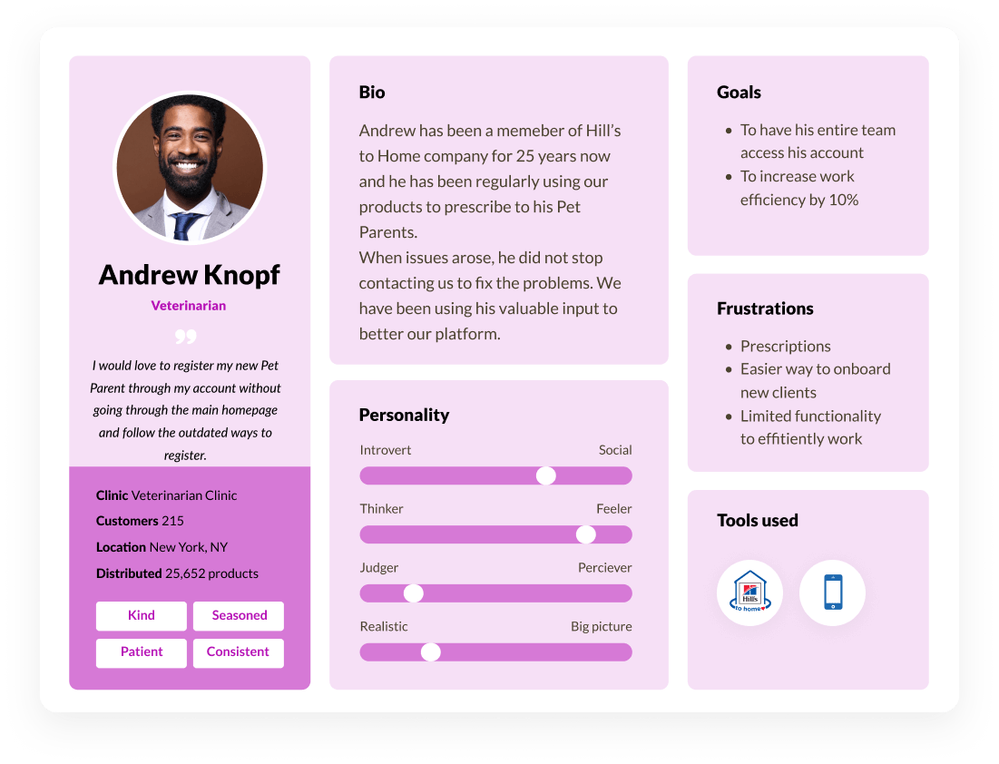
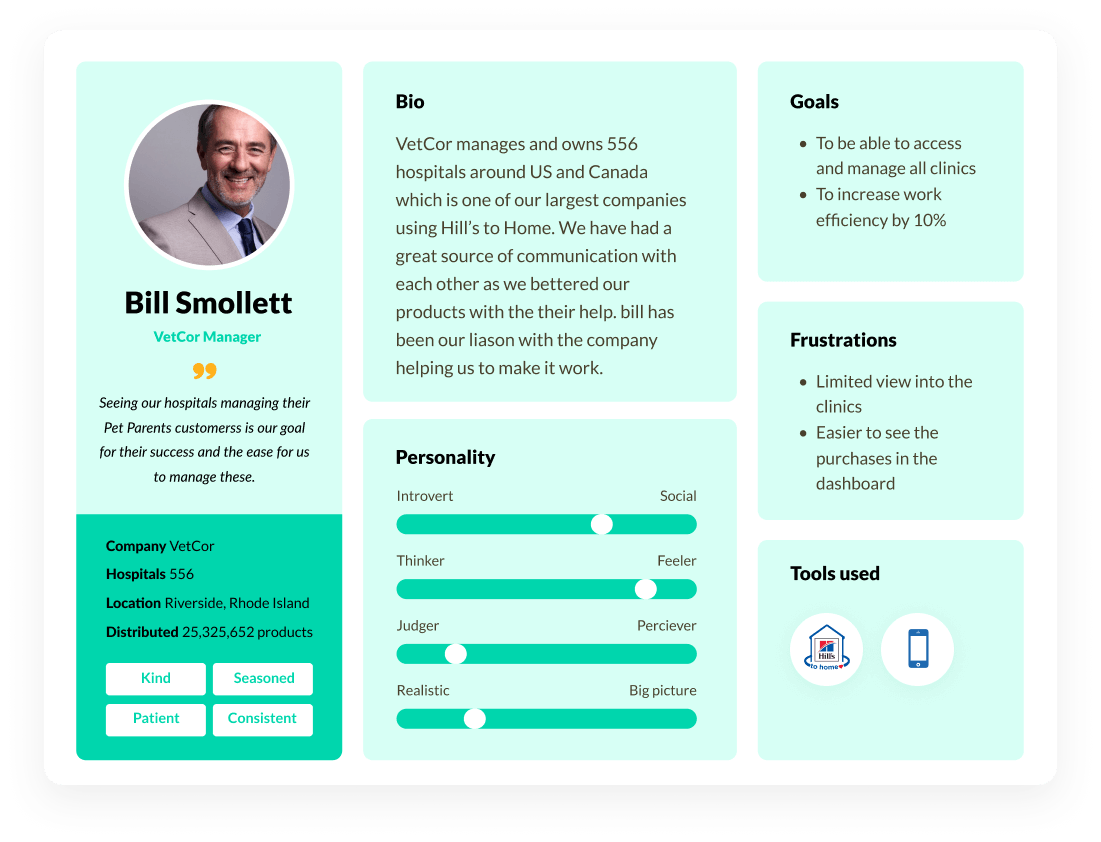
Personas
Based on current company’s existing customers we have already established personas. These personas showcased information regarding in the same interest and that is having a pet and providing a service related to the pet. A Veterinarian clinic- could be from 1 clinic to hundreds of clinics per company and Pet Parent owner who can have from 1 pet to tens of pets due to their breeding or rescuing facilities.
User flows
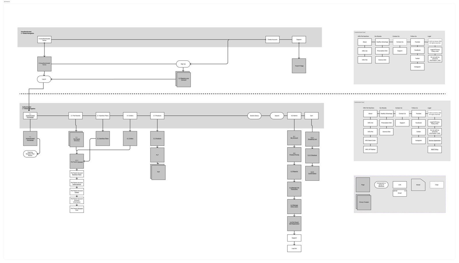
Now that we had a better understanding of the big-picture sitemap, it was time to dive in and work on the specific routes and flows the user would take throughout the platform.
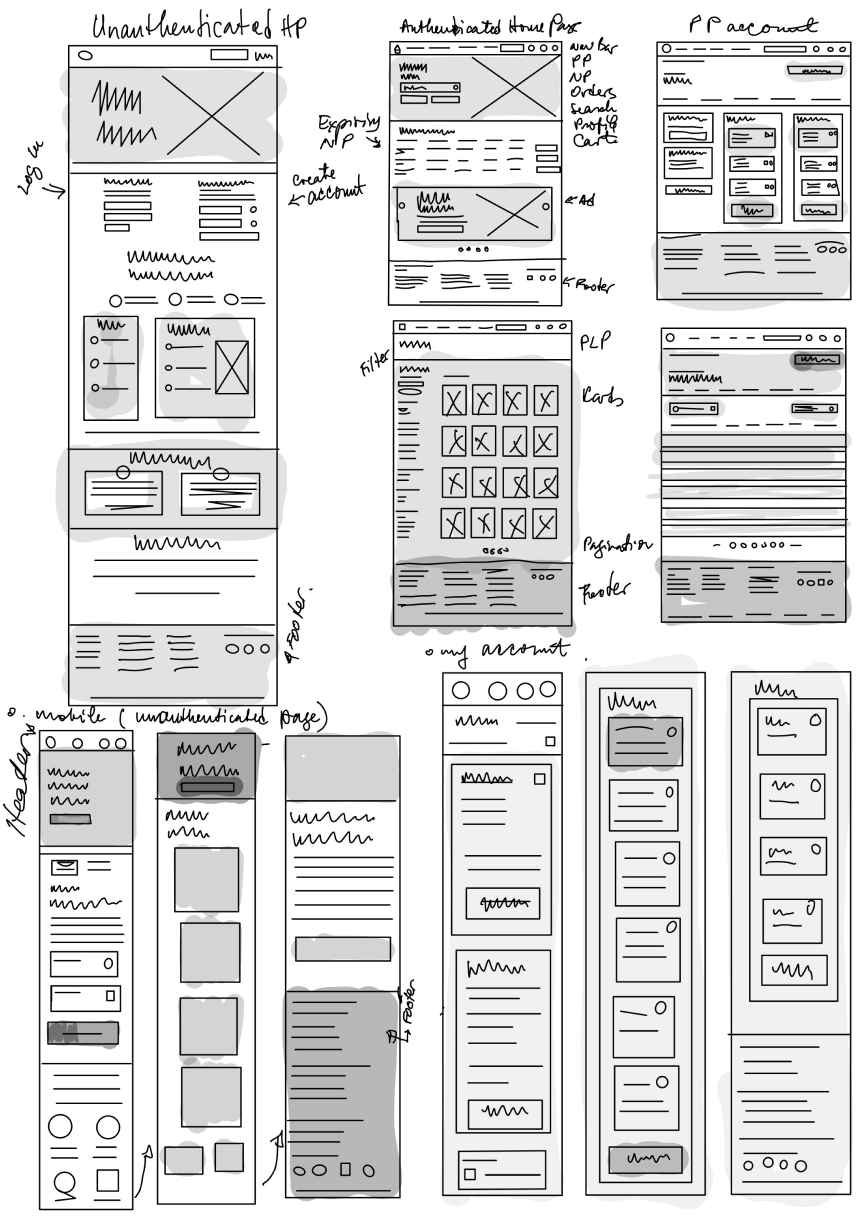
Designing the product: Sketches
The product design cycle starts with sketching/low fidelity wireframes to quickly render ideas. The focus at this stage is to work through the methodology behind how the product works and not focus on color, imagery, illustrations etc.
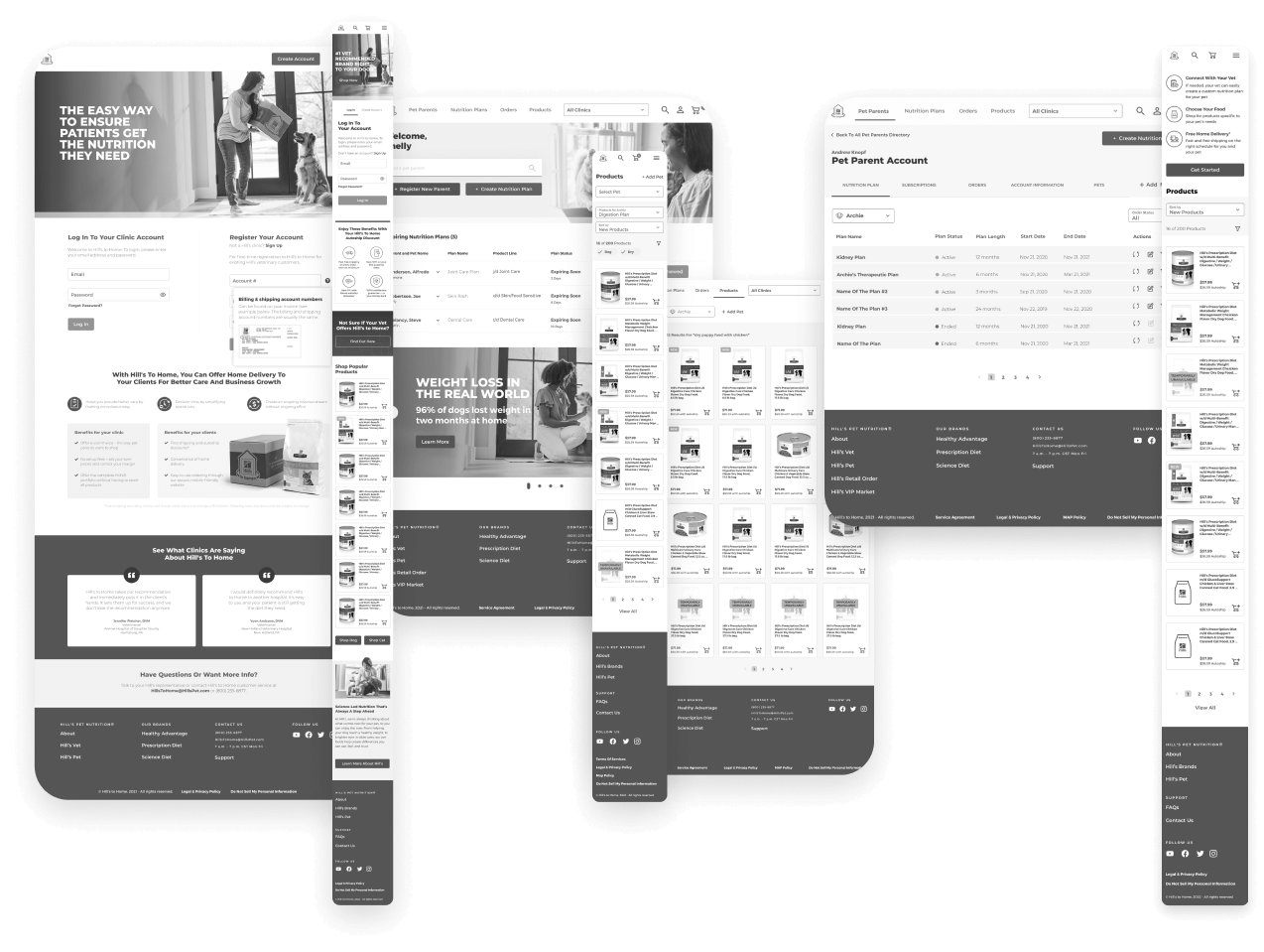
Designing the product: Wireframes
Once we have refined sketches, its time to move to annotated wireframes. These are higher fidelity digital black and white renderings showcasing more details.
Usability Testing
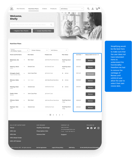
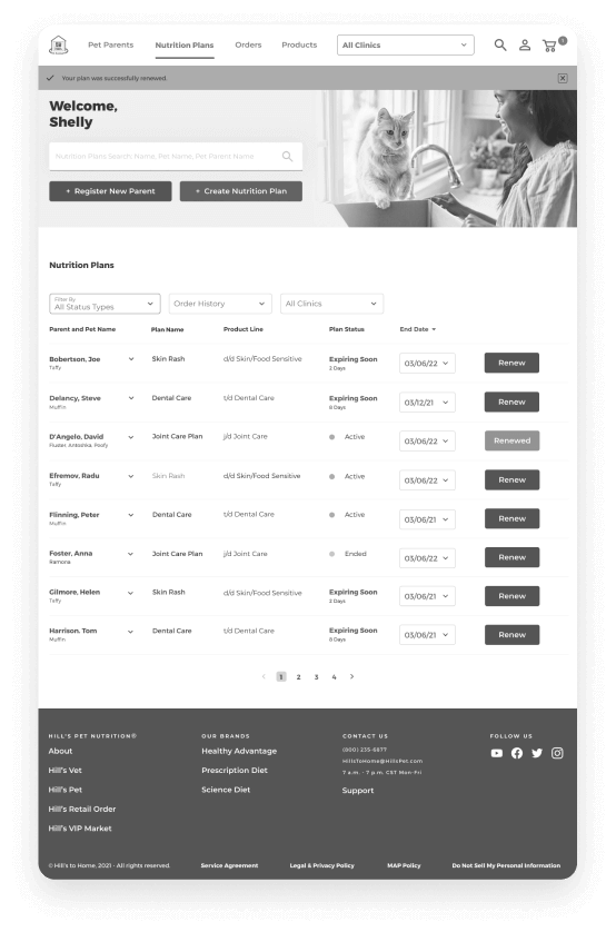
Once we had the core functionality of the web experience wireframed, we’ve put together an interactive prototype & tested the usability with users. Throughout this process we discovered several ux issues that needed to be addressed and that is when the Dev team has spoken concerns with several functionalities. The idea was to simplify not to complicate issues with this new direction.
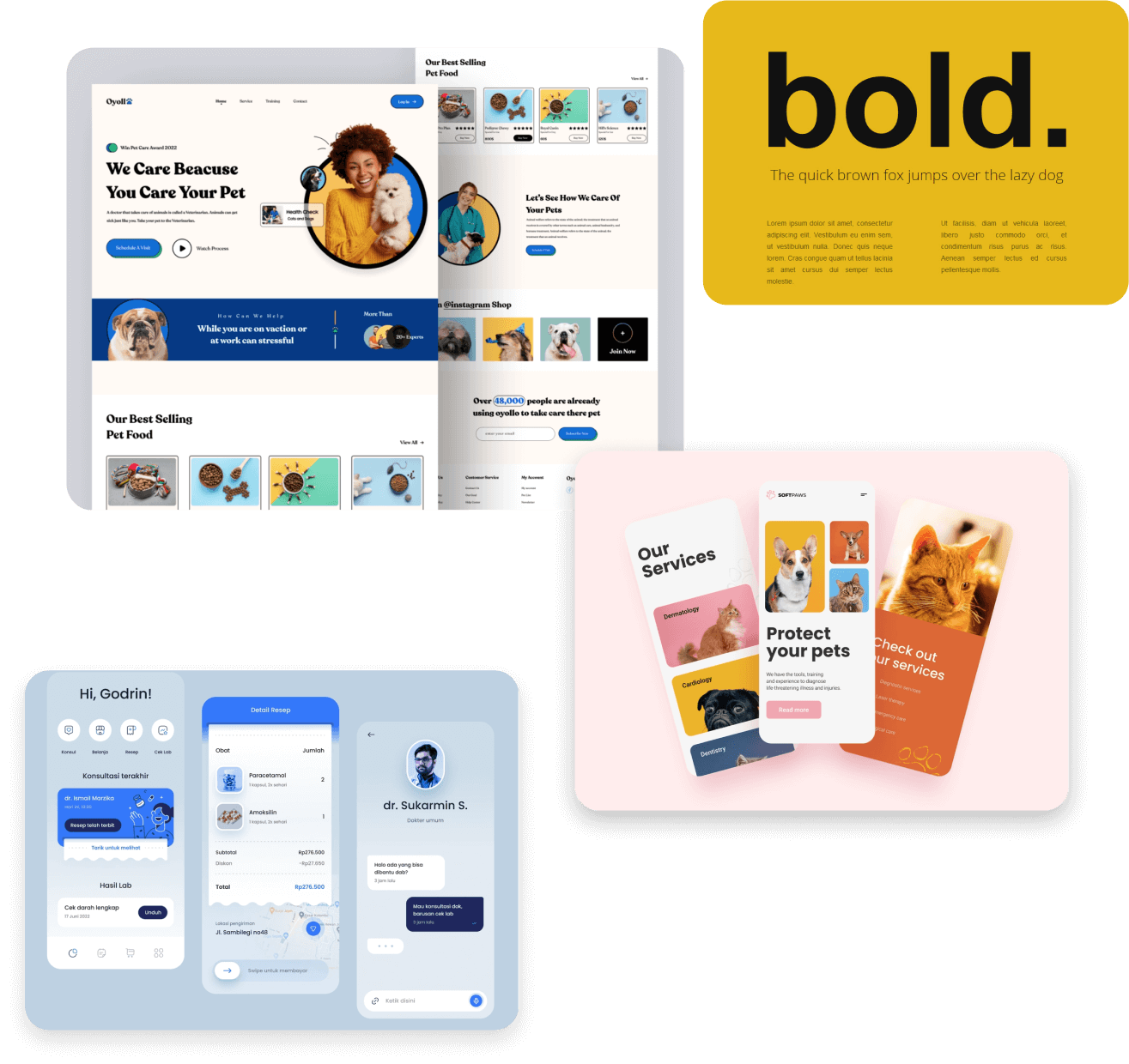
Style guide / mood boards
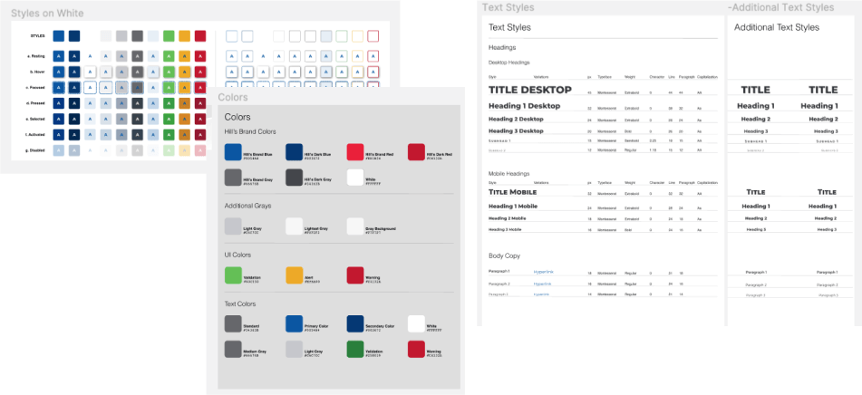
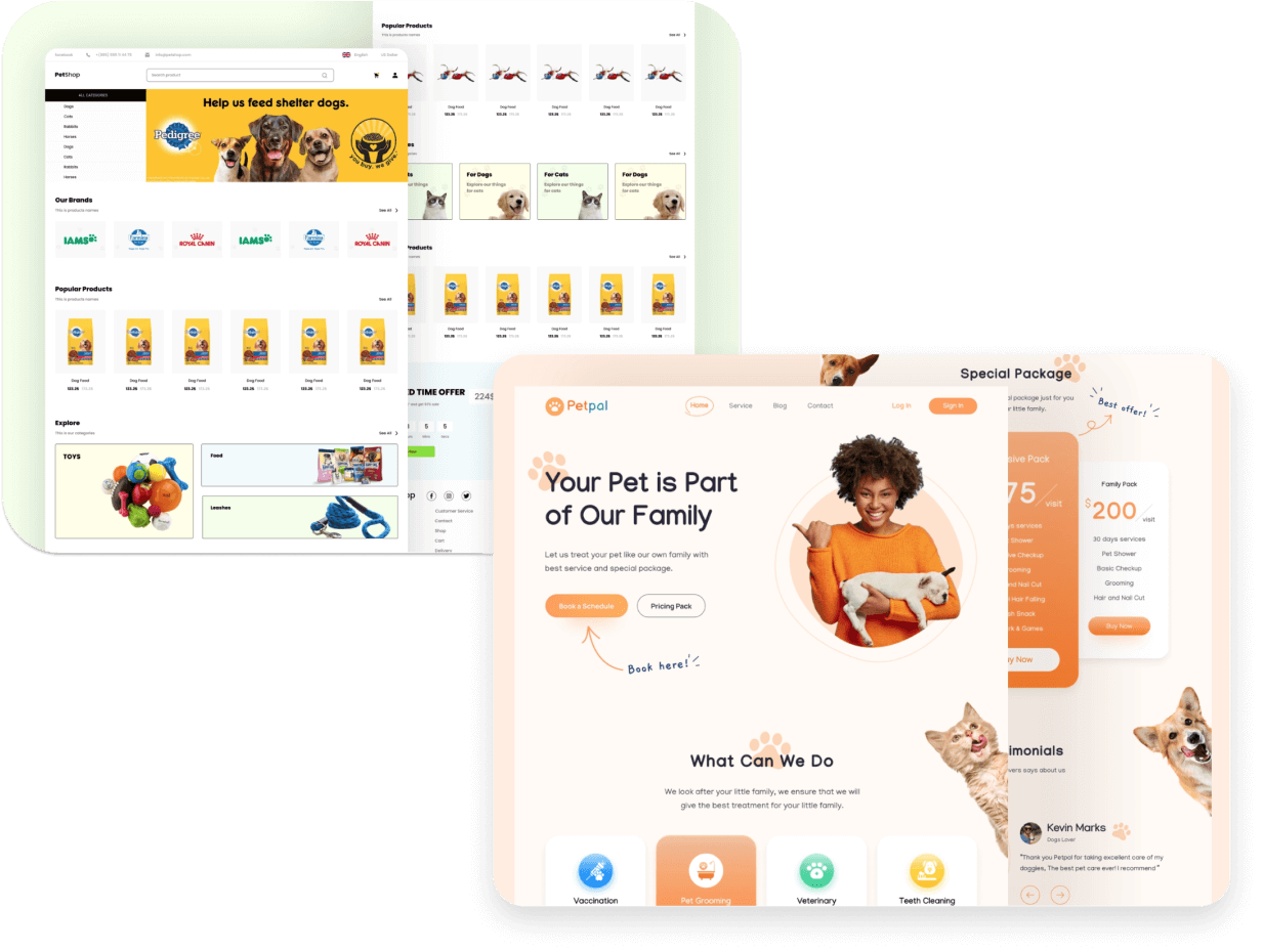
Now that we had the ux stage complete, before diving into the user interface design, it was time to put together a mood-board with various styles to help determine the visual direction.
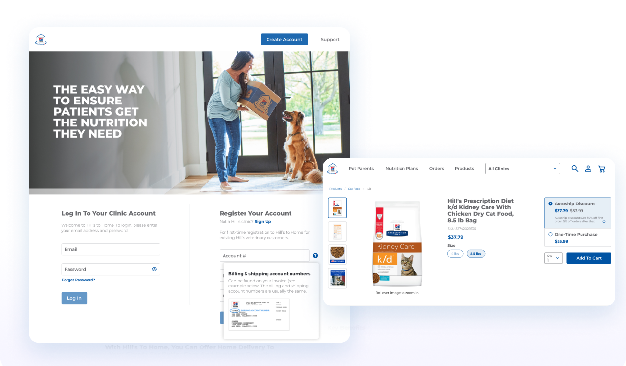
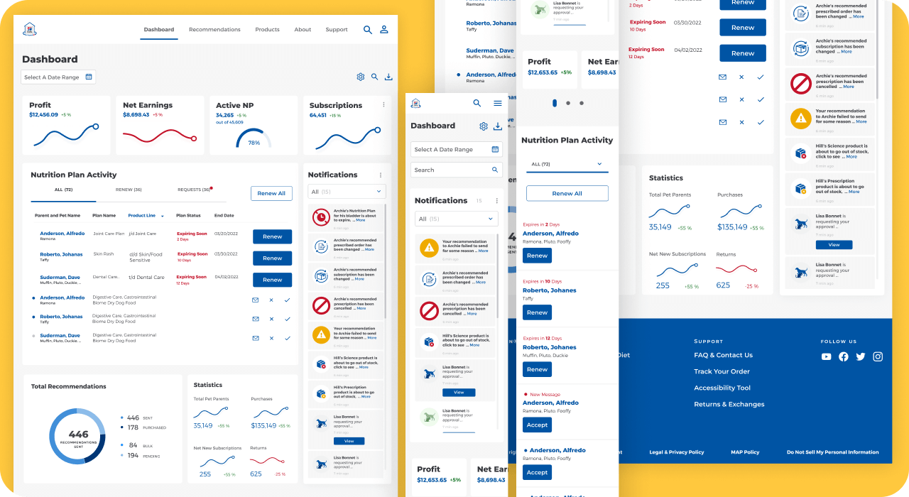
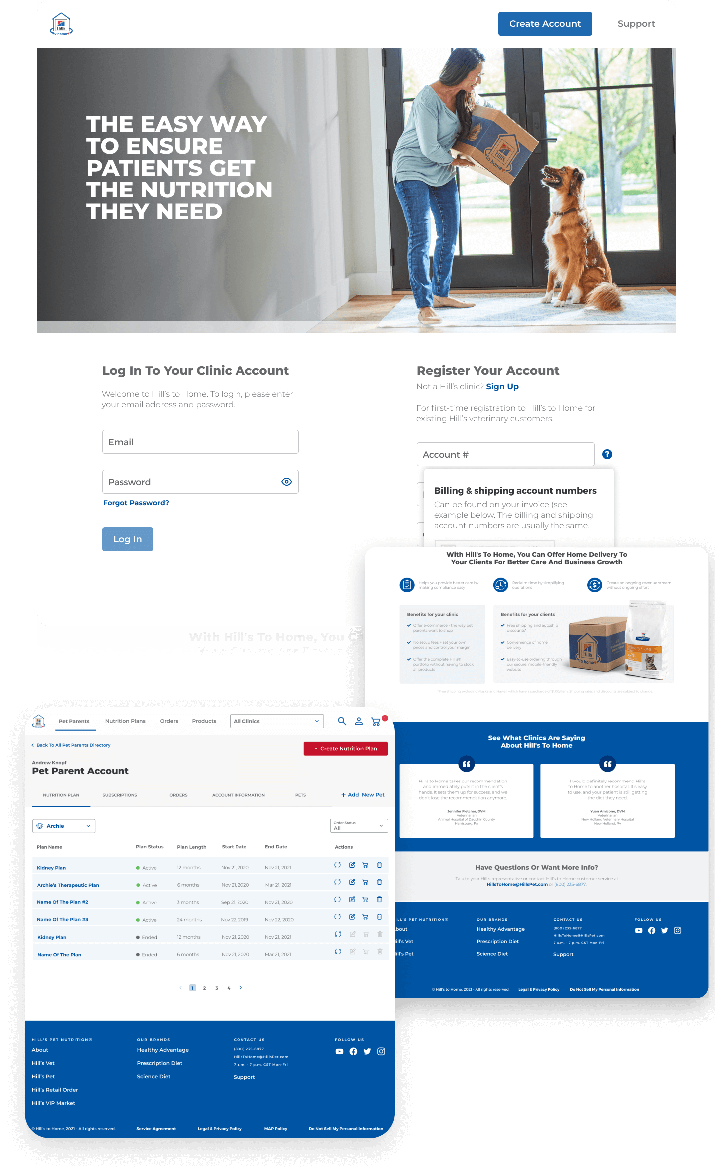
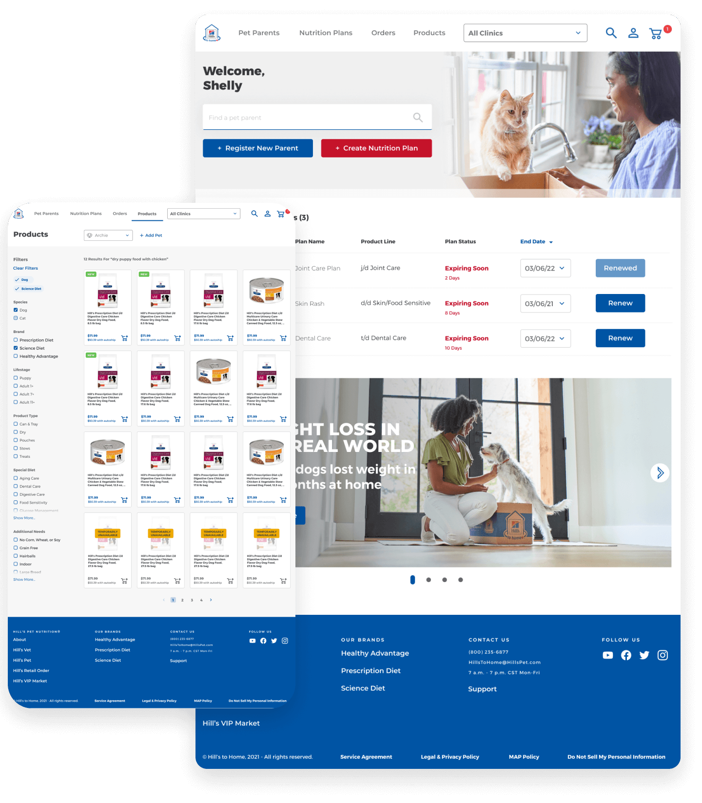
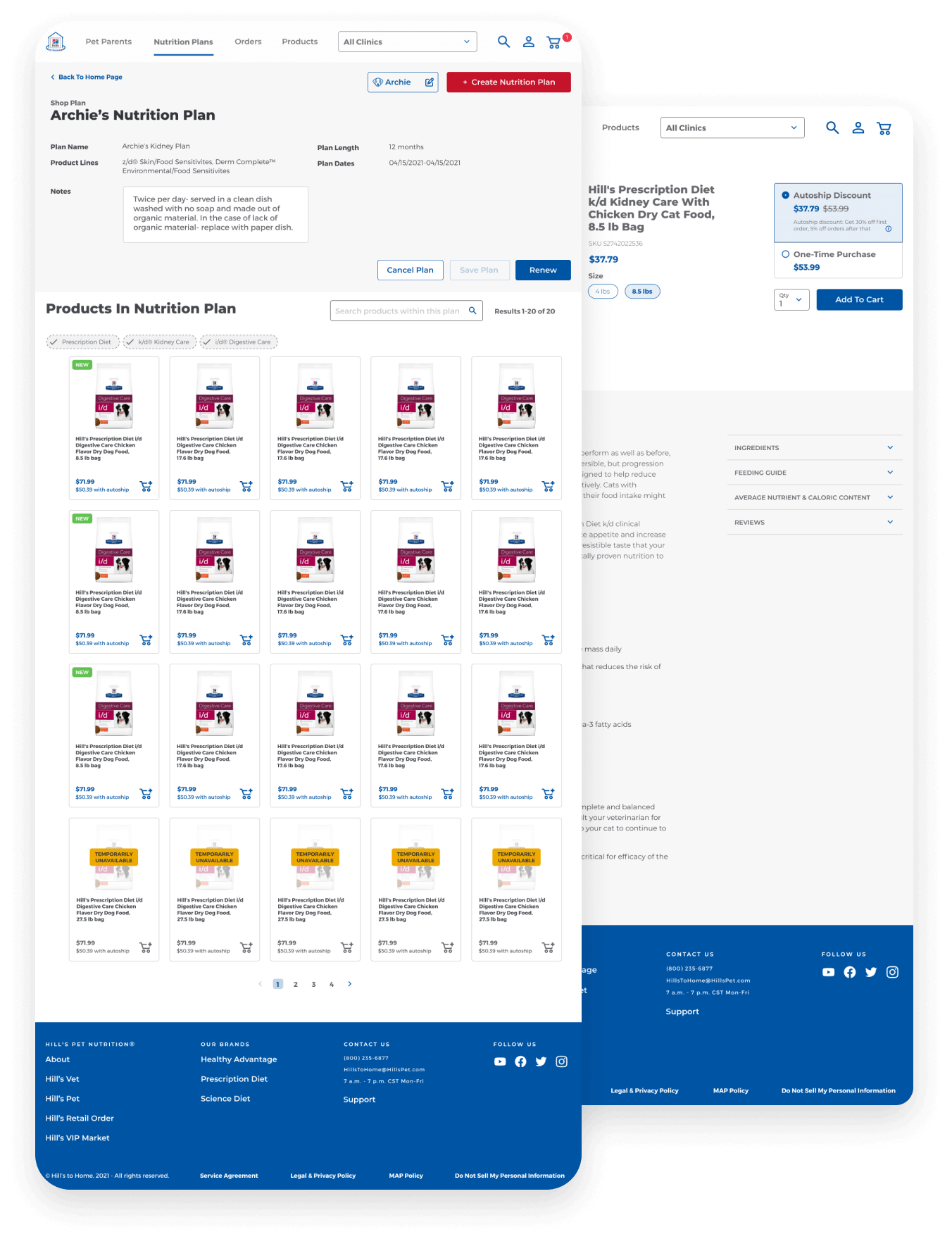
User interface design: Desktop
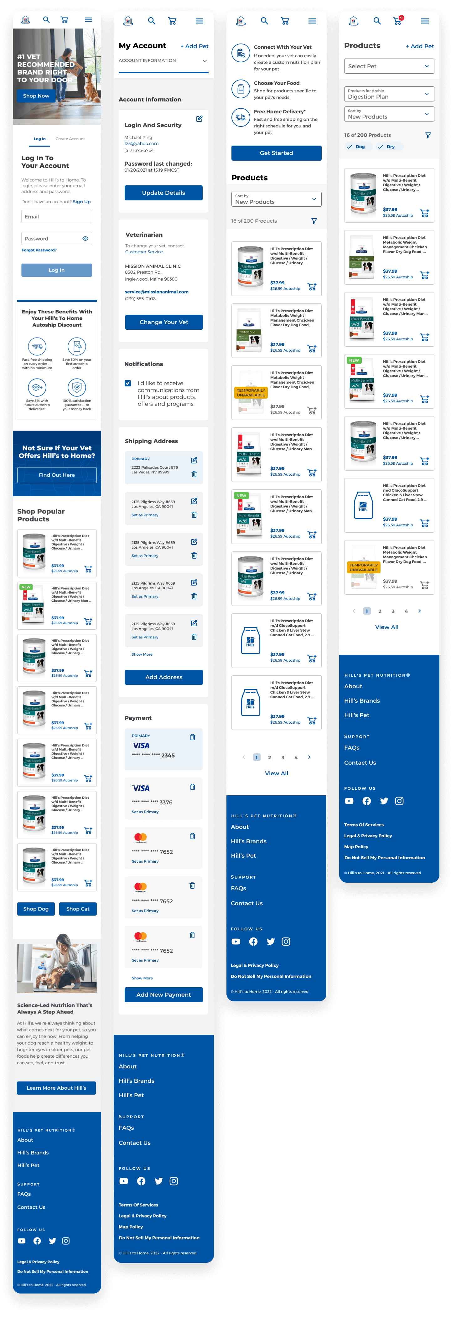
User interface design: Mobile
